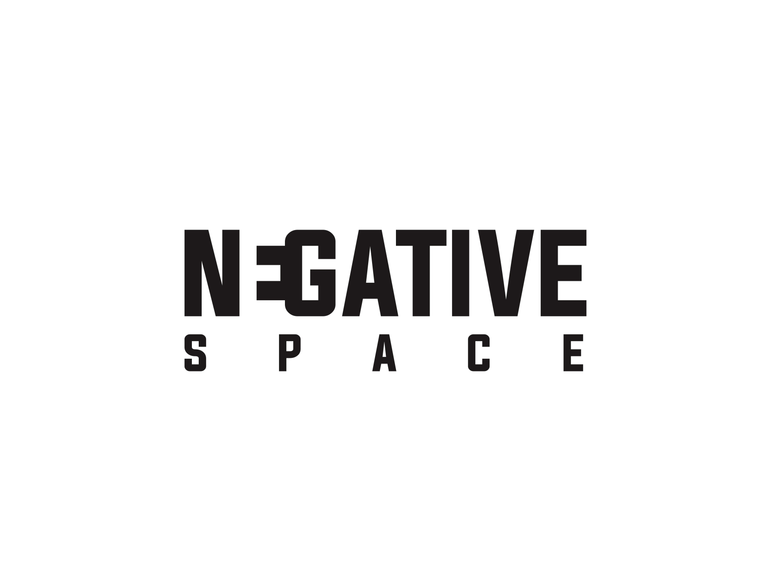
A minimalist logo is a type of logo design that is characterized by its simplicity and minimalism. It usually features simple shapes, lines, and typography, with a focus on negative space and a limited color palette. The purpose of a minimalist logo is to convey the essence of a brand in a clean and uncluttered way, while making a strong visual impact.
Minimalist logos are popular because they are easy to recognize and remember. They also have a timeless quality that allows them to remain relevant and effective over time. Many well-known brands, such as Nike, Apple, and Google, use minimalist logos to represent their brand identity.
When designing a minimalist logo, it’s important to focus on the essential elements of the brand and strip away any unnecessary details. The logo should be easily scalable and legible in different sizes and contexts, such as on websites, social media, and marketing materials.
Overall, a well-designed minimalist logo can be a powerful tool for building a strong brand identity and making a lasting impression on customers.
Designing a minimalist logo requires careful attention to detail and a focus on simplicity. Here are some tips and tricks for creating a minimalist logo that effectively represents your brand:
Focus on the essentials
The first step in creating a minimalist logo is to focus on the essential elements of the brand. Consider the core values and characteristics that define the brand, and try to distill these into a simple, recognizable symbol or icon.
Use negative space
Negative space refers to the space around and between the elements of a design. When designing a minimalist logo, negative space can be used to create subtle, yet impactful visual effects. Consider how negative space can be used to create a hidden shape or message within the logo.
Keep it simple
A minimalist logo should be simple and easy to recognize. Avoid using too many elements, and focus on creating a clean, uncluttered design. Stick to a limited color palette and use typography sparingly.
Ensure scalability
A minimalist logo should be easily scalable, meaning it should look good in both large and small sizes. Consider how the logo will look on different platforms and mediums, such as social media, websites, and printed materials.
Test and refine
Once you have a basic design for your minimalist logo, test it on different platforms and contexts to see how it performs. Refine the design as needed to ensure that it effectively represents the brand and resonates with the target audience.
Work with a professional
Creating a minimalist logo requires a high level of design skill and attention to detail. Consider working with a professional logo designer who has experience creating minimalist logos that effectively represent a brand’s identity and values.
Overall, a well-designed minimalist logo can be a powerful tool for building a strong brand identity and making a lasting impression on customers. By focusing on the essentials, using negative space, and keeping the design simple and scalable, you can create a minimalist logo that effectively represents your brand and resonates with your target audience.
Selecting the right colors for a minimalist logo is crucial to its success. Here are some tips for choosing the best colors for a minimalist logo:
Stick to a limited color palette: A minimalist logo should have a limited color palette, typically consisting of one or two colors. This helps to create a clean, uncluttered design that is easily recognizable.
Consider the brand personality: The colors used in a minimalist logo should reflect the brand’s personality and values. For example, blue is often associated with trust and professionalism, while green is associated with growth and nature.
Use high-contrast colors: When selecting colors for a minimalist logo, consider using high-contrast colors that will make the design stand out. For example, black and white or red and white can create a strong visual impact.
Test different color combinations: Try out different color combinations to see which ones work best for the brand and design. Experiment with different shades and tones of the same color, as well as complementary or contrasting colors.
Consider the context: The colors used in a minimalist logo should be appropriate for the context in which it will be used. For example, a minimalist logo for a children’s brand might use bright, playful colors, while a minimalist logo for a financial institution might use more muted, professional colors.
Overall, choosing the right colors for a minimalist logo requires careful consideration of the brand’s personality, values, and context. By sticking to a limited color palette, using high-contrast colors, and testing different color combinations, you can create a minimalist logo that effectively represents the brand and resonates with the target audience.
A mascot logo is a type of logo design that features a character or a creature as the main element of the design. Mascot logos are often used by sports teams, schools, and businesses to create a fun and approachable brand identity. They can be anthropomorphic animals, humans, or even abstract shapes.
Mascot logos are effective because they create a strong emotional connection with the audience. They have the ability to convey a range of emotions, from strength and power to playfulness and humor. Mascots can also help to differentiate a brand from its competitors and make it more memorable.
When designing a mascot logo, it’s important to consider the target audience and the brand personality. The mascot should be consistent with the brand’s voice and values. It’s also important to keep the design simple and easily recognizable, as mascots are often used on various marketing materials and merchandise.
Overall, a well-designed mascot logo can be a powerful tool for building a strong brand identity and creating a memorable visual representation of the brand.
Mascot logos are a great way to create a fun and approachable brand identity. Here are some tips and a general process to follow when creating a mascot logo:
Understand your brand personality:
The first step in creating a mascot logo is to understand your brand personality. What kind of emotions and values do you want to convey? Your mascot should be consistent with your brand voice and resonate with your target audience.
Research and sketch:
Research different mascot logos to get inspiration and ideas. Sketch out rough ideas for your mascot, exploring different shapes, colors, and styles.
Choose your mascot type:
Decide on the type of mascot that best fits your brand. Will it be an animal, a human character, or an abstract shape? Consider the characteristics and symbolism associated with each option.
Refine your design:
Once you have a basic concept for your mascot, refine the design by adding details and tweaking the shape and colors. Ensure that the mascot is easily recognizable and looks good in different sizes.
Test your mascot:
Test your mascot on different platforms and contexts to see how it works in practice. Ensure that it’s legible and scalable across different devices and media.
Finalize your design:
Once you’re happy with your mascot logo, finalize the design and prepare it for use on your website, social media, and marketing materials.
When designing a mascot logo, it’s important to keep it simple and memorable. The mascot should be easily identifiable and convey a strong sense of brand personality. Work with a professional logo designer to create a high-quality mascot logo that effectively represents your brand and appeals to your target audience.
Logo design is a critical aspect of brand identity, and it plays a vital role in the success of any business. A logo is a visual representation of a company, and it can communicate a lot about the company’s values, products, and services. A well-designed logo can create a lasting impression on the target audience and can even help a company stand out in a crowded market.
Designing a logo is not an easy task, and it requires a great deal of creativity, research, and expertise. There are many different elements that go into creating an effective logo, including color, typography, shape, and style. Here are some key factors to consider when designing a logo:
Simplicity: A simple logo is more memorable and easier to recognize than a complex one. A simple design can also be more versatile and adaptable, which is important for branding purposes.
Color: Colors can have a significant impact on how a logo is perceived. Different colors can evoke different emotions, and it’s essential to choose colors that align with the company’s values and brand personality.
Typography: The font used in a logo can also affect how it is perceived. A font that is too fancy or difficult to read can detract from the logo’s effectiveness, while a simple and clear font can make the logo more memorable.
Originality: A logo should be unique and distinctive to stand out from the competition. It’s important to avoid using generic templates or copying other logos.
Scalability: A logo should be scalable and adaptable to different sizes and formats, from large billboards to small business cards.
In addition to these factors, it’s essential to consider the target audience when designing a logo. A logo for a children’s toy company will look very different from a logo for a law firm, for example. It’s important to research the target audience and understand their preferences and expectations.
Once a logo is designed, it’s important to protect it through trademark registration. Trademark registration can prevent others from using a similar logo, which can help protect the company’s brand identity.
In conclusion, logo design is a critical aspect of brand identity and plays a vital role in the success of any business. A well-designed logo can create a lasting impression on the target audience and help a company stand out in a crowded market. When designing a logo, it’s important to consider factors such as simplicity, color, typography, originality, and scalability, as well as the target audience’s preferences and expectations. With careful planning and execution, a great logo can be a powerful tool for building a strong brand identity.
There are several different types of logos, and each type has its own unique characteristics and uses. Here are some of the most common types of logos:
Wordmark or logotype:
A wordmark or logotype is a logo that consists of the company’s name in a stylized font. This type of logo is effective for companies with short and distinctive names, and it can help to establish brand recognition. Examples of companies with wordmark logos include Coca-Cola, Google, and IBM.
Lettermark:
A lettermark is similar to a wordmark, but it uses the initials or acronym of the company’s name. This type of logo is useful for companies with long names, and it can help to simplify the branding process. Examples of companies with lettermark logos include NASA, IBM, and HBO.
Icon or symbol:
An icon or symbol is a logo that uses a graphic or image to represent the company. This type of logo is useful for companies with recognizable visual elements, and it can help to create a unique and memorable brand identity. Examples of companies with icon or symbol logos include Apple, Nike, and McDonald’s.
Combination mark:
A combination mark is a logo that combines both text and graphics. This type of logo is useful for companies that want to incorporate both their name and a recognizable symbol or graphic. Examples of companies with combination mark logos include Burger King, Lacoste, and Doritos.
Emblem:
An emblem is a logo that uses a graphic or image inside a shape or emblem. This type of logo is useful for companies that want to create a traditional and classic look. Examples of companies with emblem logos include Starbucks, Harley-Davidson, and BMW.
Mascot:
A mascot is a logo that uses a character or animal to represent the company. This type of logo is useful for companies that want to create a friendly and approachable brand identity. Examples of companies with mascot logos include KFC’s Colonel Sanders, Pillsbury’s Doughboy, and Planters’ Mr. Peanut.
Each type of logo has its own unique characteristics and uses, and the choice of logo type will depend on the company’s brand identity, target audience, and overall marketing strategy. Working with a professional logo designer can help to create a logo that effectively represents the company and its values.
In recent years, sustainability has become a top concern in every industry, including design. Designers have a significant role to play in creating a more sustainable future by adopting eco-friendly practices and principles. In this article, we’ll explore some tips and best practices for designing sustainably, and how designers can make a positive impact on the environment.
Eco-Friendly Design: Creating Sustainable Solutions for a Better Future
In recent years, the world has become increasingly aware of the importance of sustainability and environmental responsibility. This has led to a growing interest in eco-friendly design, which seeks to create products, buildings, and systems that are environmentally friendly and sustainable. Eco-friendly design is an important aspect of modern design, and its importance is only going to grow in the years ahead. In this article, we will explore some of the best practices and tips for designing sustainably, and how eco-friendly design can make a difference in creating a better future for all.
Use Sustainable Materials: One of the most important aspects of eco-friendly design is the use of sustainable materials. This means using materials that are environmentally friendly, renewable, and have a minimal impact on the environment. Examples of sustainable materials include bamboo, recycled wood, recycled plastic, and organic cotton.
Reduce Energy Consumption: Another important aspect of eco-friendly design is reducing energy consumption. This can be achieved by using energy-efficient lighting, appliances, and HVAC systems. Designers should also consider using passive solar heating and cooling systems, which can significantly reduce the amount of energy needed to heat or cool a building.
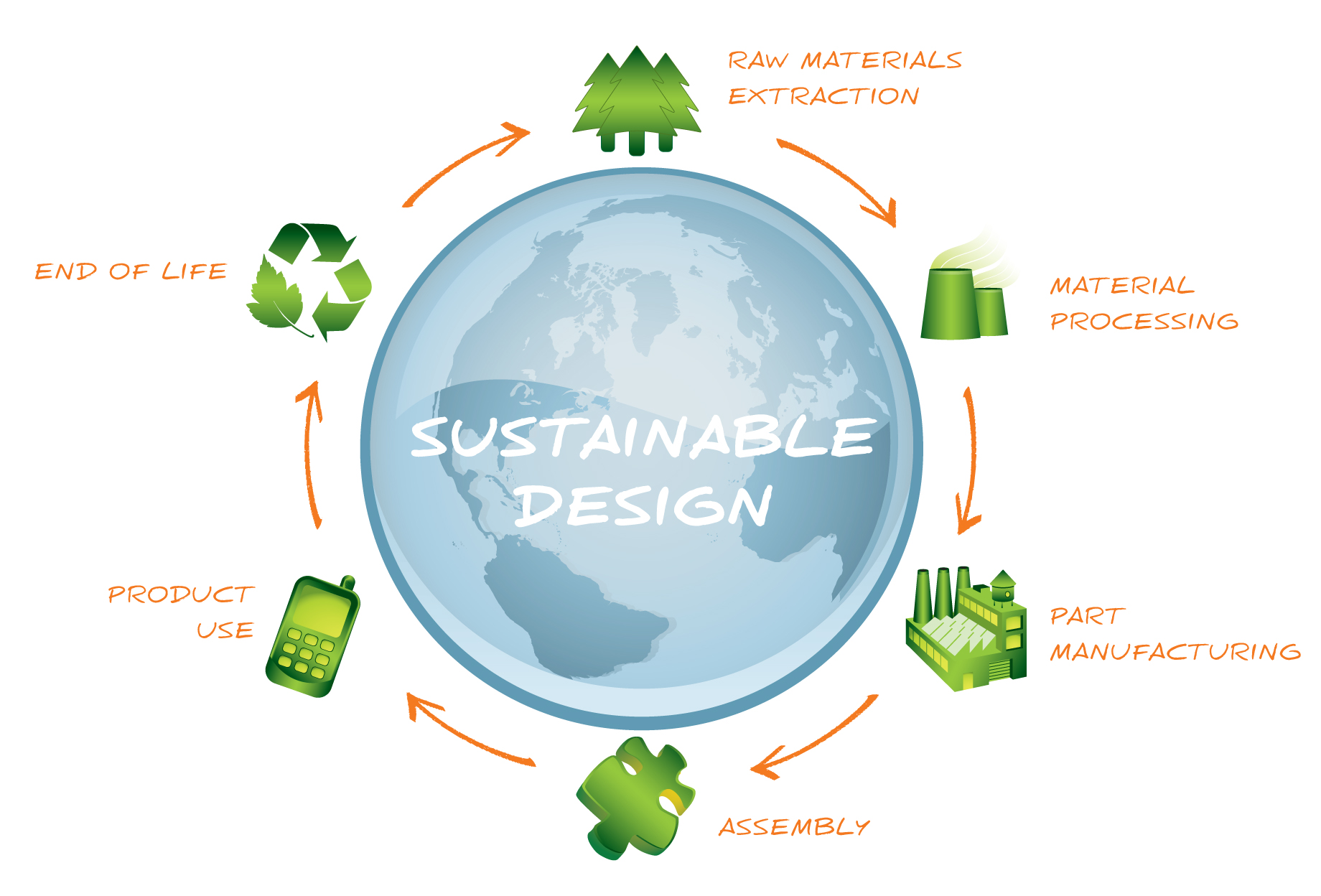
Consider the Lifecycle of the Product: When designing a product, it is important to consider its entire lifecycle. This includes the production, use, and disposal of the product. Designers should aim to create products that are durable, reusable, and recyclable. They should also consider the environmental impact of the manufacturing process, and try to reduce waste and energy consumption.
Incorporate Natural Elements: Natural elements, such as plants and water features, can help to create a more sustainable and eco-friendly design. Plants can help to purify the air and reduce the amount of carbon dioxide in the environment. Water features, such as rain gardens and bioswales, can help to reduce stormwater runoff and prevent erosion.
Use Sustainable Building Practices: When designing a building, it is important to use sustainable building practices. This includes using materials that are locally sourced and have a low environmental impact. It also involves designing buildings that are energy-efficient, such as using passive solar heating and cooling systems, and incorporating green roofs and walls.
Consider the Environmental Impact of Transportation: When designing a product, it is important to consider the environmental impact of transportation. This includes the transportation of materials to the manufacturing site, as well as the transportation of the finished product to the consumer. Designers should aim to reduce the distance that materials and products need to travel, and consider using sustainable transportation methods, such as electric vehicles or bicycles.
Reduce Water Consumption: Water is a precious resource, and it is important to reduce water consumption in eco-friendly design. This can be achieved by using water-efficient fixtures, such as low-flow toilets and faucets. Designers should also consider incorporating rainwater harvesting systems and gray water reuse systems.
Use Renewable Energy Sources: Another important aspect of eco-friendly design is the use of renewable energy sources. This includes solar, wind, and geothermal energy. By using renewable energy sources, designers can significantly reduce the amount of greenhouse gas emissions that are produced by the building or product.
Educate Consumers: Finally, it is important to educate consumers about the benefits of eco-friendly design. This includes explaining how sustainable materials and practices are used in the product, and how they can reduce their own environmental impact by using eco-friendly products.
Overall, eco-friendly design is an important aspect of modern design. By following these best practices and tips, designers can create products, buildings, and systems that are environmentally friendly, sustainable, and help to create a better future for all.
Designing with the Environment in Mind: Best Practices for Sustainability
As our society becomes increasingly aware of the environmental impact of our actions, sustainable design practices have become more important than ever. In the world of design, there are countless ways to incorporate eco-friendly principles into your work, from using recycled materials to reducing waste and energy consumption.
Here are some best practices for designing with sustainability in mind:
Use Sustainable Materials: One of the most important things you can do as a designer is to use sustainable materials in your work. This means choosing materials that are renewable, recyclable, and non-toxic. Some examples include bamboo, recycled paper, and organic cotton.
Reduce Waste: In any design project, there is always the potential for waste. To minimize this impact, be mindful of the materials you use and strive to use them efficiently. This could mean designing with modular components that can be easily disassembled and reused, or choosing materials that can be recycled at the end of their life.
Optimize Energy Efficiency: Another important consideration is the energy consumed by your design. This could mean using energy-efficient lighting in your space, or designing products that require less energy to operate. By reducing energy consumption, you can help reduce greenhouse gas emissions and slow climate change.
Consider Lifecycle Analysis: To truly understand the environmental impact of your design, it’s important to consider the entire lifecycle of your product. This includes the extraction and manufacturing of materials, transportation, use, and disposal. By understanding the full lifecycle of your design, you can make informed decisions that minimize its environmental impact.
Educate and Advocate: As a designer, you have a unique opportunity to educate others about the importance of sustainability. Share your knowledge and expertise with your clients and peers, and advocate for sustainable design practices in your industry.
By incorporating these best practices into your work, you can create designs that are not only beautiful and functional, but also environmentally responsible. By designing with sustainability in mind, you can help build a more sustainable future for all.
The Importance of Sustainable Design in a Changing World
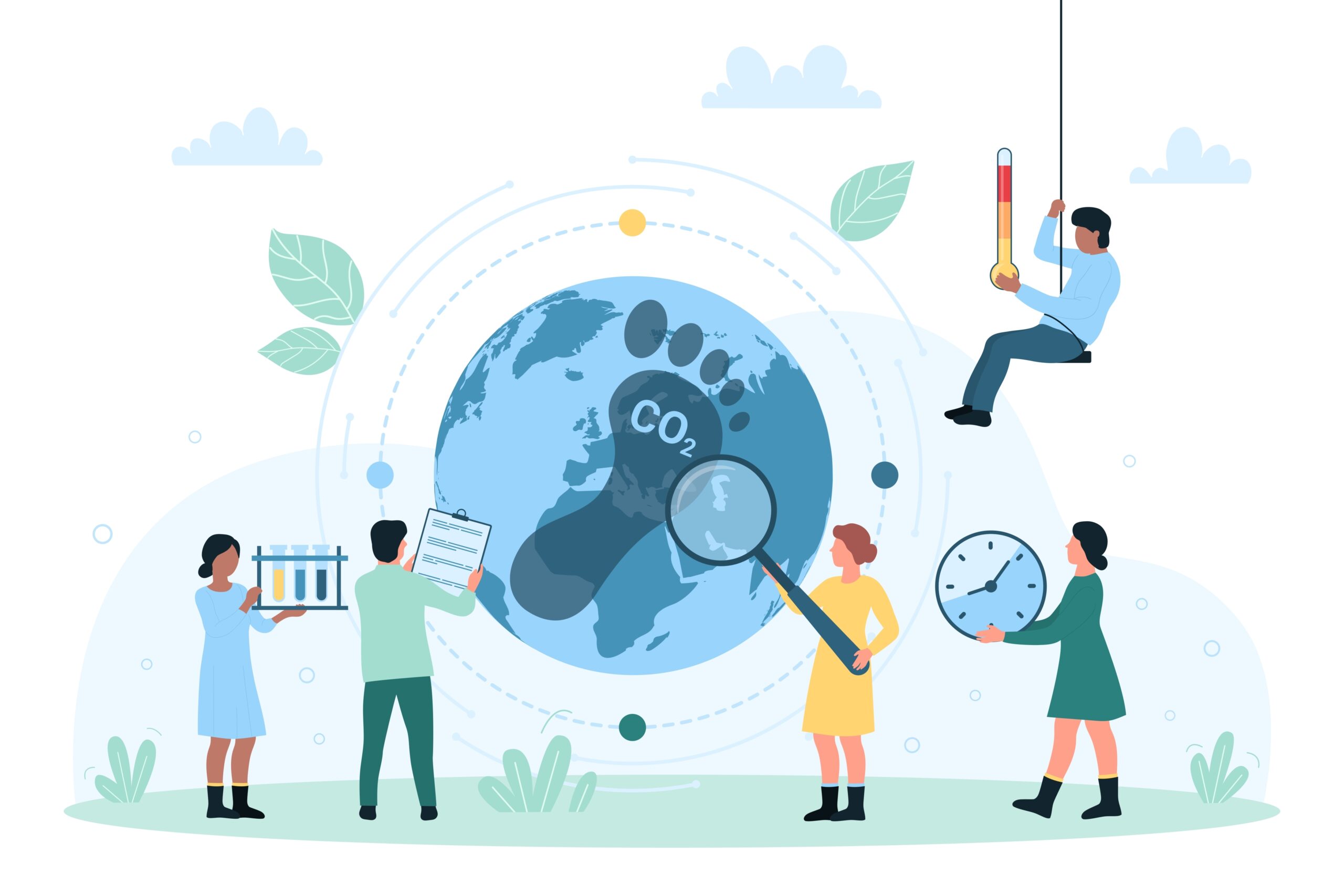
Sustainable design is becoming increasingly important in a world where climate change, pollution, and resource depletion are major concerns. As designers, we have a responsibility to create products, buildings, and systems that are environmentally sustainable and socially responsible. Here are some key reasons why sustainable design is so important:
Reducing Environmental Impact: Sustainable design aims to minimize the environmental impact of products and systems by using materials and resources that are renewable, recycled, or low-impact. This can help reduce carbon emissions, waste, and pollution, and minimize the use of non-renewable resources.
Conserving Resources: Sustainable design is about using resources wisely and conserving them for future generations. By using sustainable materials and practices, we can help reduce waste, conserve energy and water, and promote sustainable agriculture and forestry.
Promoting Social Responsibility: Sustainable design also has a social responsibility aspect. It’s about creating products and systems that are not only environmentally sustainable, but also socially responsible. This means designing products that are safe, healthy, and fair for workers, consumers, and communities.
Enhancing Quality of Life: Sustainable design can also enhance the quality of life for people by creating healthier, more sustainable living and working environments. Sustainable buildings, for example, can improve indoor air quality, reduce energy consumption, and promote healthier lifestyles.
Meeting Customer Demand: Consumers are becoming increasingly aware of environmental issues and are demanding more sustainable products and services. Sustainable design can help meet this demand and give businesses a competitive advantage.
Designing for sustainability requires a shift in mindset and a commitment to making positive changes. It’s about designing products and systems that work in harmony with the natural world, while also meeting the needs of people and communities. By embracing sustainable design, we can help create a more sustainable and equitable world for all.
Green Design: How Designers Can Make a Positive Impact on the Environment
Green design is an approach to design that emphasizes creating environmentally-friendly products, services, and systems. The goal of green design is to reduce the negative impact that humans have on the environment by promoting sustainability, resource efficiency, and ecological responsibility.
Green design can be applied to all areas of design, from product design to architecture to graphic design. By incorporating sustainable materials and production processes, designers can reduce waste, conserve energy, and minimize their carbon footprint.
Here are some ways that designers can make a positive impact on the environment through green design:
Use sustainable materials: Designers can choose materials that are renewable, biodegradable, or recycled. This includes materials like bamboo, hemp, and recycled plastic. By using sustainable materials, designers can reduce the environmental impact of their products and promote a more circular economy.
Reduce waste: Designers can also reduce waste by creating products that are durable, repairable, and recyclable. By designing products with a longer lifespan, designers can reduce the amount of waste that ends up in landfills.
Conserve energy: Designers can incorporate energy-efficient technologies and design strategies into their products and buildings. This includes things like passive solar design, efficient lighting, and renewable energy sources like solar and wind power.
Promote sustainable behavior: Designers can also promote sustainable behavior by designing products and systems that encourage people to conserve resources. For example, designers can create apps that track energy usage, or design products that make it easy to recycle.
Collaborate with experts: Designers can work with experts in sustainability and environmental science to ensure that their designs are as sustainable as possible. By collaborating with experts, designers can stay up-to-date on the latest green technologies and design strategies.
In summary, green design is an important approach to design that can help reduce the negative impact that humans have on the environment. By incorporating sustainable materials, reducing waste, conserving energy, promoting sustainable behavior, and collaborating with experts, designers can make a positive impact on the environment and promote a more sustainable future.
Designing for Sustainability: Practical Tips for a Greener Future
As more people become aware of the impact of human activity on the environment, sustainable design has become increasingly important in the world of design. Designers are now expected to take a more responsible approach to their work, using eco-friendly materials, reducing waste, and minimizing their carbon footprint. In this article, we’ll explore some practical tips for designing for sustainability.
Use sustainable materials: Start by choosing sustainable materials such as bamboo, cork, and recycled paper. These materials are renewable, biodegradable, and have a lower impact on the environment than traditional materials.
Reduce waste: Aim to reduce waste by minimizing the use of non-recyclable materials such as plastics and foam. Also, consider ways to repurpose materials that would otherwise be discarded.
Optimize energy efficiency: Design for energy efficiency by using energy-saving technologies and techniques such as LED lighting, natural lighting, and energy-efficient appliances.
Design for durability: Create products that are built to last. Durable products require fewer replacements and repairs, which reduces waste and saves energy.
Consider the product life cycle: Design with the product life cycle in mind, from the production stage to disposal. Consider how the product will be manufactured, used, and disposed of, and look for ways to reduce its environmental impact at every stage.
Use eco-friendly printing techniques: Choose printing techniques that have a lower environmental impact, such as waterless printing, vegetable-based inks, and recycled paper.
Incorporate sustainable practices into your design process: Integrate sustainability into your design process by conducting research, setting sustainability goals, and measuring the environmental impact of your designs.
Educate clients and users: Educate clients and users about the importance of sustainability and how your design incorporates sustainable practices.
Partner with eco-conscious suppliers: Partner with suppliers that share your commitment to sustainability. Work with suppliers that offer eco-friendly materials, use sustainable manufacturing practices, and have a track record of environmental responsibility.
Stay up to date with the latest sustainable design trends and techniques: Finally, stay up to date with the latest sustainable design trends and techniques. Attend workshops and conferences, read industry publications, and join online communities to stay informed.
Designing for sustainability is not only good for the environment but also good for business. Consumers are increasingly looking for products and services that are environmentally responsible, and sustainable design can give you a competitive edge in the market. By following these tips, you can create designs that are both beautiful and eco-friendly, and help build a more sustainable future.
Sustainable Design: Why It Matters and How to Get Started
Sustainable design is a design philosophy that emphasizes minimizing the negative impact on the environment, society, and economy. As people become increasingly aware of the importance of sustainability, more and more businesses are adopting sustainable practices, and design is no exception. In this article, we will explore why sustainable design matters and how to get started.
Why Sustainable Design Matters
Reducing Environmental Impact: Sustainable design aims to reduce the negative impact of human activities on the environment. By using eco-friendly materials and designing for energy efficiency, designers can help reduce carbon emissions and slow down climate change.
Improving Social Responsibility: Sustainable design considers the needs of people and communities. Designers can create products that are inclusive, accessible, and equitable. They can also ensure that workers involved in the production process are treated fairly and ethically.
Economic Benefits: Sustainable design can help reduce costs in the long run. For example, designing energy-efficient products can lower utility bills for consumers, while using eco-friendly materials can reduce waste and the cost of disposal.
How to Get Started with Sustainable Design
Research and Education: Before designing anything, it’s important to research sustainable design practices and understand the impact of design decisions on the environment and society. This can involve taking courses, attending seminars, and reading books and articles on sustainable design.
Material Selection: Sustainable design requires the use of eco-friendly materials, such as recycled or biodegradable materials. Designers can research and compare materials to find the most sustainable options for their project.
Energy Efficiency: Designers can make products more energy-efficient by using energy-saving technologies and designing products that require less energy to operate. For example, designing products that use renewable energy sources like solar or wind power.
End-of-Life Considerations: Designers should consider what happens to a product at the end of its lifecycle. This involves designing products that can be easily disassembled, recycled, or repurposed. Designers can also explore ways to extend the life of products by making them repairable and upgradeable.
Collaboration and Advocacy: Sustainable design requires collaboration between designers, manufacturers, and consumers. Designers can advocate for sustainable design practices and work with manufacturers to implement them. They can also collaborate with consumers to create products that meet their needs and preferences while being sustainable.
In conclusion, sustainable design is becoming increasingly important in today’s world. By reducing environmental impact, improving social responsibility, and providing economic benefits, sustainable design can create a better future for everyone. To get started with sustainable design, it’s important to research, select eco-friendly materials, focus on energy efficiency, consider end-of-life options, and collaborate with others in the industry.
Reducing Environmental Impact Through Eco-Friendly Design
Eco-friendly design is becoming increasingly important in today’s world. As concerns about climate change and environmental degradation continue to grow, many designers are looking for ways to reduce their environmental impact. By designing with sustainability in mind, designers can create products and spaces that are not only beautiful and functional but also eco-friendly.
Here are some ways designers can reduce their environmental impact through eco-friendly design:
Use sustainable materials: When selecting materials for a project, look for sustainable options such as bamboo, reclaimed wood, recycled glass, or recycled metal. These materials are often more durable and long-lasting than traditional materials, and they have a smaller environmental footprint.
Design for durability: Create products and spaces that are built to last. This means selecting high-quality materials, designing for easy repair and maintenance, and avoiding trendy designs that may quickly go out of style.
Reduce waste: Minimize waste during the design and manufacturing process by using efficient production methods and designing products that can be disassembled and recycled at the end of their life cycle.
Energy-efficient design: Incorporate energy-efficient lighting, heating, and cooling systems into your designs. This will not only reduce your environmental impact but also save your clients money on their energy bills.
Biophilic design: Incorporate nature into your designs by using natural materials, designing spaces that take advantage of natural light and views, and including plants and other natural elements. Biophilic design has been shown to improve air quality, reduce stress, and enhance productivity.
Consider the entire lifecycle of a product: Think beyond the design and manufacturing process and consider the entire lifecycle of a product. This includes transportation, use, and end-of-life disposal. By designing with the entire lifecycle in mind, you can create products that are more sustainable and environmentally friendly.
By designing for sustainability, designers can make a positive impact on the environment and create a better future for all.
Sustainable Graphic Design: Strategies for a Greener Industry
Graphic design is a crucial aspect of modern business, and it plays a critical role in shaping our world. However, it is also one of the most environmentally impactful industries, consuming large amounts of resources, energy, and materials. As a result, the need for sustainable graphic design has become increasingly crucial. In this article, we will discuss strategies for creating a greener industry by implementing sustainable graphic design practices.
Use Environmentally-Friendly Materials
One of the most effective ways to promote sustainable graphic design is to use environmentally-friendly materials. For example, using recycled paper, vegetable-based inks, and biodegradable packaging can significantly reduce the environmental impact of your designs. You can also explore alternative materials like bamboo or hemp paper, which have a lower carbon footprint than traditional paper.
Reduce Energy Consumption
Reducing energy consumption is another effective way to promote sustainable graphic design. Simple practices like turning off unused computers and equipment, using energy-efficient lighting, and maximizing natural light can significantly reduce your carbon footprint. You can also explore renewable energy options like solar panels or wind turbines to power your design studio.
Minimize Waste
Waste reduction is another critical aspect of sustainable graphic design. You can minimize waste by designing products with a longer lifespan, encouraging clients to opt for digital solutions, and reducing the use of unnecessary packaging. Additionally, you can explore options like composting or recycling to further reduce waste.
Prioritize Collaboration
Collaboration is a vital component of sustainable graphic design. By collaborating with other designers and stakeholders, you can create more effective designs that meet the needs of your clients while minimizing environmental impact. Additionally, you can also leverage the collective expertise of your team to develop innovative solutions that promote sustainability.
Educate Clients
Finally, educating clients about sustainable graphic design is essential to creating a greener industry. You can help clients understand the impact of their design choices and encourage them to opt for sustainable materials and practices. Additionally, you can also offer sustainability-focused design solutions that align with their values and goals.
In conclusion, sustainable graphic design is an increasingly vital aspect of the industry. By implementing sustainable practices like using environmentally-friendly materials, reducing energy consumption, minimizing waste, prioritizing collaboration, and educating clients, we can create a greener and more sustainable industry for the future.
Eco-Conscious Design: Tips and Best Practices for Sustainable Living
As the world becomes more aware of the environmental impact of human activities, it’s important for designers to incorporate eco-friendly practices into their work. From choosing sustainable materials to reducing waste, there are many ways to make your design process more environmentally conscious. Here are some tips and best practices for sustainable living in design:
Choose Sustainable Materials: One of the best ways to reduce the environmental impact of your designs is to choose sustainable materials. This can include recycled paper, biodegradable plastics, and sustainable fabrics such as bamboo or organic cotton.
Use Energy-Efficient Equipment: By using energy-efficient equipment such as computers, printers, and lighting, you can significantly reduce your energy consumption and carbon footprint.
Reduce Waste: Waste reduction is a crucial aspect of sustainable design. You can reduce waste by using digital design tools, recycling materials, and printing only what you need.
Design for Durability: When creating products or packaging, design for durability so they can last longer and reduce the need for replacements.
Choose Local Suppliers: Choosing local suppliers can reduce the carbon footprint associated with transportation and support local businesses.
Incorporate Sustainable Design Principles: Incorporating principles such as cradle-to-cradle design, circular economy, and life cycle assessment into your design process can help minimize waste and environmental impact.
Educate Your Clients: Educate your clients about the benefits of sustainable design and how it can positively impact the environment.
By incorporating these tips and best practices into your design process, you can reduce your environmental impact and create sustainable solutions for a greener future.
Sustainability in Design: Creating Beautiful and Responsible Solutions
Design has always been about finding solutions to problems, but in recent years, designers have been increasingly aware of the need for these solutions to be sustainable. As the effects of climate change become more apparent, and resources become scarcer, it’s more important than ever to consider the environmental impact of our designs.
Sustainable design is about creating products, buildings, and systems that meet our needs without compromising the ability of future generations to meet their own needs. It’s about using resources efficiently, reducing waste and pollution, and minimizing the environmental impact of our designs.
Here are some strategies for creating sustainable design solutions:
Use Renewable Materials One of the key principles of sustainable design is using renewable materials. Renewable materials are those that can be replenished, such as bamboo, cork, and recycled materials. By using renewable materials, designers can reduce their reliance on non-renewable resources like oil, gas, and coal.
Reduce Energy Consumption Another way to create sustainable designs is to reduce energy consumption. This can be achieved through the use of energy-efficient materials and technologies, such as LED lighting, solar panels, and smart thermostats. Designers can also reduce energy consumption by designing buildings and products that are more thermally efficient, meaning they require less energy to heat and cool.
Minimize Waste Designers can also minimize waste by creating products that are durable and long-lasting, and by designing products that can be easily disassembled and recycled at the end of their life. Additionally, designers can reduce waste by using materials that have been recycled or repurposed, and by designing products that require less packaging.
Consider the Life Cycle of Products When designing products, it’s important to consider their entire life cycle, from the extraction of raw materials to their disposal at the end of their life. By doing so, designers can identify opportunities to reduce the environmental impact of their designs. For example, a product that is made from recycled materials and can be recycled again at the end of its life has a much lower environmental impact than a product that is made from virgin materials and cannot be recycled.
Collaborate with Sustainable Suppliers Designers can also make a difference by collaborating with suppliers that prioritize sustainability. This includes suppliers that use renewable energy, minimize waste, and reduce their environmental impact. By working with sustainable suppliers, designers can help create a more sustainable supply chain.
In conclusion, sustainable design is an important consideration for designers in today’s world. By using renewable materials, reducing energy consumption, minimizing waste, considering the life cycle of products, and collaborating with sustainable suppliers, designers can create beautiful and responsible solutions that meet our needs without compromising the needs of future generations.
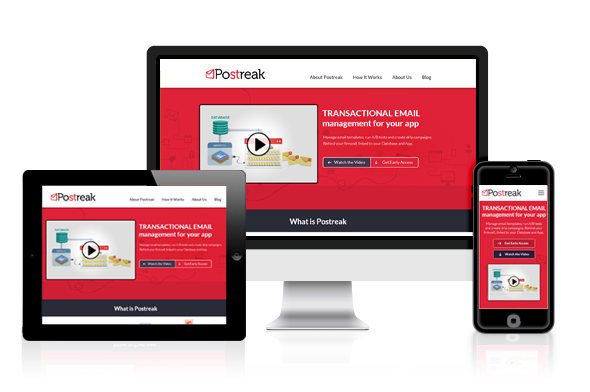
As more and more people use their smartphones and tablets to browse the internet, the importance of responsive design for websites and apps is becoming increasingly apparent. Responsive design is the process of designing websites and applications to adapt to different screen sizes and orientations, providing a seamless user experience across all devices.
In this article, we will explore the importance of responsive design for websites and apps, its benefits, and some tips on how to implement it effectively.
Why Responsive Design is a Must-Have for Modern Websites and Apps
In today’s digital age, having a website or app that looks good and functions well on any device is crucial. Responsive design is the key to achieving this. Here are some reasons why responsive design is a must-have for modern websites and apps:
Mobile Usage is Increasing: Mobile usage has overtaken desktop usage, making it essential for websites and apps to be mobile-friendly. If your website or app is not optimized for mobile devices, users are likely to abandon it and look for a competitor’s site that is mobile-friendly.
Improved User Experience: Responsive design improves user experience by allowing users to access your website or app on any device without any issues. With responsive design, your website or app will automatically adjust to the screen size of the device, providing a seamless experience.
Better SEO: Google prefers responsive websites and ranks them higher in search results. Responsive design ensures that your website or app can be easily crawled by search engines, which improves your search engine optimization (SEO) efforts.
Cost-effective: Responsive design is cost-effective in the long run. Instead of creating multiple versions of your website or app for different devices, responsive design allows you to have a single website or app that adapts to all devices.
Future-Proof: With the rise of new devices and screen sizes, responsive design ensures that your website or app is future-proof. It can easily adapt to new devices without the need for a complete redesign.
In conclusion, responsive design is a must-have for modern websites and apps. It improves user experience, SEO, and is cost-effective in the long run. With the increasing use of mobile devices, it is essential to have a website or app that is accessible on any device.
The Benefits of Responsive Design for User Experience and SEO
Responsive design has become a necessity for modern websites and apps due to its many benefits for user experience (UX) and search engine optimization (SEO). Here are some of the most important benefits of responsive design:
Improved user experience: With responsive design, users can access your website or app on any device, including desktops, laptops, tablets, and smartphones, and the content will adjust automatically to fit the screen size. This means that users can enjoy a consistent and seamless experience regardless of the device they are using, leading to higher engagement, longer sessions, and lower bounce rates.
Cost-effective and efficient: Instead of building separate websites or apps for different devices, responsive design allows you to create a single design that adapts to all screen sizes. This means you can save time, money, and resources on development, maintenance, and updates.
Increased SEO performance: Search engines like Google prefer responsive design because it helps them crawl and index your content more easily and accurately. With responsive design, you have a single URL and HTML code for all devices, which means there is no need to create separate mobile versions or duplicate content. This can lead to higher search engine rankings, more organic traffic, and better conversion rates.
Future-proof: With the rapid pace of technological change, it is impossible to predict what devices and screen sizes will be popular in the future. Responsive design provides a flexible and adaptable framework that can accommodate new devices and technologies as they emerge, without the need for significant redesign or development.
In summary, responsive design is a must-have for modern websites and apps because it improves user experience, is cost-effective and efficient, boosts SEO performance, and is future-proof. By implementing responsive design, you can ensure that your website or app delivers a high-quality experience to all users, regardless of the device they are using.
How to Make Your Website or App Responsive: Best Practices
Having a responsive website or app is crucial in today’s digital landscape. With a variety of devices available to access the internet, it’s essential to ensure that your website or app looks great and functions well on all of them. Here are some best practices for making your website or app responsive:
Use a Mobile-First Approach: When designing your website or app, start with the mobile version first. This ensures that you prioritize the most critical information and elements and ensure they fit on a smaller screen.
Utilize Responsive Design Frameworks: Responsive design frameworks like Bootstrap or Foundation provide pre-built templates and CSS stylesheets that make designing a responsive website or app much easier.
Optimize Images and Media: Large image files can slow down page load times and negatively impact the user experience. Use compression tools to optimize images for web use, and consider using responsive media queries to adjust the size of images based on screen size.
Design for Touchscreens: With more and more people using touchscreens to access the internet, it’s essential to design your website or app with touch gestures in mind. Ensure that buttons and links are easy to tap, and allow for swiping and scrolling.
Test on Multiple Devices: To ensure that your website or app is truly responsive, test it on a variety of devices with different screen sizes, including smartphones, tablets, laptops, and desktop computers.
By following these best practices, you can create a website or app that provides an excellent user experience across all devices, helping to improve engagement and drive conversions.
The Impact of Mobile Devices on Web Design and Development
Mobile devices such as smartphones and tablets have revolutionized the way we access information and communicate with others. As a result, web design and development have undergone significant changes in recent years to adapt to the unique challenges and opportunities presented by mobile devices.
Here are some of the key ways that mobile devices have impacted web design and development:
Mobile-first approach: With more users accessing websites and apps from their mobile devices than ever before, many designers and developers are now taking a mobile-first approach to their work. This means designing and developing the mobile version of a site or app before tackling the desktop version. This approach ensures that the site or app is optimized for mobile users and provides a better user experience.
Responsive design: Responsive design is a design approach that aims to provide an optimal viewing experience across all devices, whether it’s a desktop computer, tablet, or smartphone. With responsive design, the site or app adapts to the screen size and orientation of the device, providing a seamless user experience.
Simplified design: With the limited screen real estate of mobile devices, designers and developers have had to simplify their designs to make them more usable on smaller screens. This has led to a trend towards minimalism and flat design, with simple, clean lines and a focus on typography and color.
Touchscreen interfaces: Mobile devices are primarily controlled through touchscreens, which require a different approach to interface design compared to traditional mouse and keyboard interfaces. Designers and developers need to ensure that buttons and other elements are big enough to be easily tapped with a finger, and that navigation is intuitive and easy to use.
App development: Mobile devices have also led to the growth of app development as a separate discipline from web design and development. While many websites are now designed to be mobile-friendly, some companies are choosing to develop dedicated apps to provide a more streamlined and customized user experience.
In conclusion, mobile devices have had a significant impact on web design and development, driving the adoption of new approaches such as mobile-first design, responsive design, and simplified design. As mobile devices continue to evolve and become more ubiquitous, designers and developers will need to keep up with the latest trends and best practices to ensure that their sites and apps provide the best possible user experience.
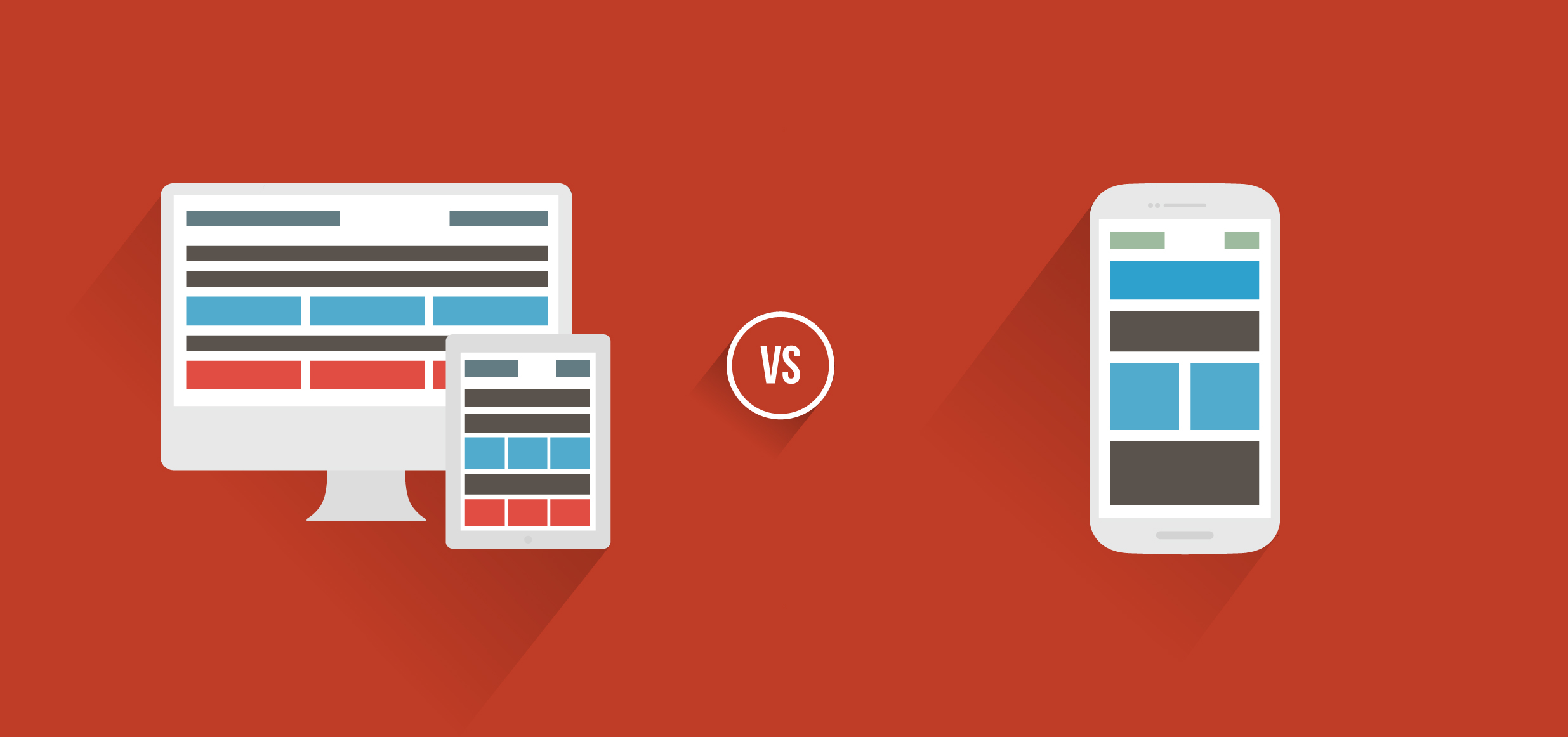
Responsive Design vs. Mobile Apps: Which is Right for Your Business?
As more and more people are using their mobile devices to access the internet, businesses are faced with a choice between creating a responsive website or a mobile app. Both options have their advantages and disadvantages, and the decision ultimately depends on the specific needs and goals of the business. In this article, we will explore the differences between responsive design and mobile apps, and help you determine which one is the right choice for your business.
Responsive Design:
Responsive design refers to the approach of designing a website that can adapt to different screen sizes and devices. This means that the website will look and function the same way on desktop, tablet, and mobile devices, providing a consistent user experience across all platforms. Responsive design is achieved through the use of flexible grids, images, and media queries, and requires only one website to be maintained.
Benefits of Responsive Design:
Cost-effective: Responsive design only requires one website to be built and maintained, which can save businesses money in the long run.
Better for SEO: Google recommends responsive design as the preferred mobile configuration, which can improve search engine rankings.
Consistent user experience: Users can access the same content and features across all devices, leading to a better user experience.
Mobile Apps:
A mobile app is a standalone application that is designed specifically for mobile devices. Unlike a responsive website, a mobile app is installed on the user’s device and can access features such as push notifications and camera functionality. Mobile apps are developed separately from websites and require maintenance for both the app and the website.
Benefits of Mobile Apps:
Increased functionality: Mobile apps can access device-specific features, such as camera and GPS, which can provide a richer and more engaging user experience.
Improved user engagement: Push notifications can be used to send updates and reminders to users, keeping them engaged with the app and the business.
Better performance: Since mobile apps are downloaded and installed on the device, they can run faster and smoother than a website.
Responsive Design vs. Mobile Apps:
When deciding between responsive design and mobile apps, consider the following factors:
Business goals: If the goal is to provide a consistent user experience and present information to users, responsive design may be the better choice. If the goal is to provide specific functionality or access device-specific features, a mobile app may be more appropriate.
User behavior: Consider how your users interact with your business. If they frequently access your website on their mobile devices, a responsive design may be the better choice. If they are looking for a specific tool or feature, a mobile app may be more convenient.
Budget: Responsive design may be the more cost-effective option, but mobile apps may provide a better return on investment in the long run.
Conclusion:
Responsive design and mobile apps both have their advantages and disadvantages, and the decision ultimately depends on the specific needs and goals of the business. By considering the business goals, user behavior, and budget, businesses can make an informed decision on whether to invest in responsive design or a mobile app.
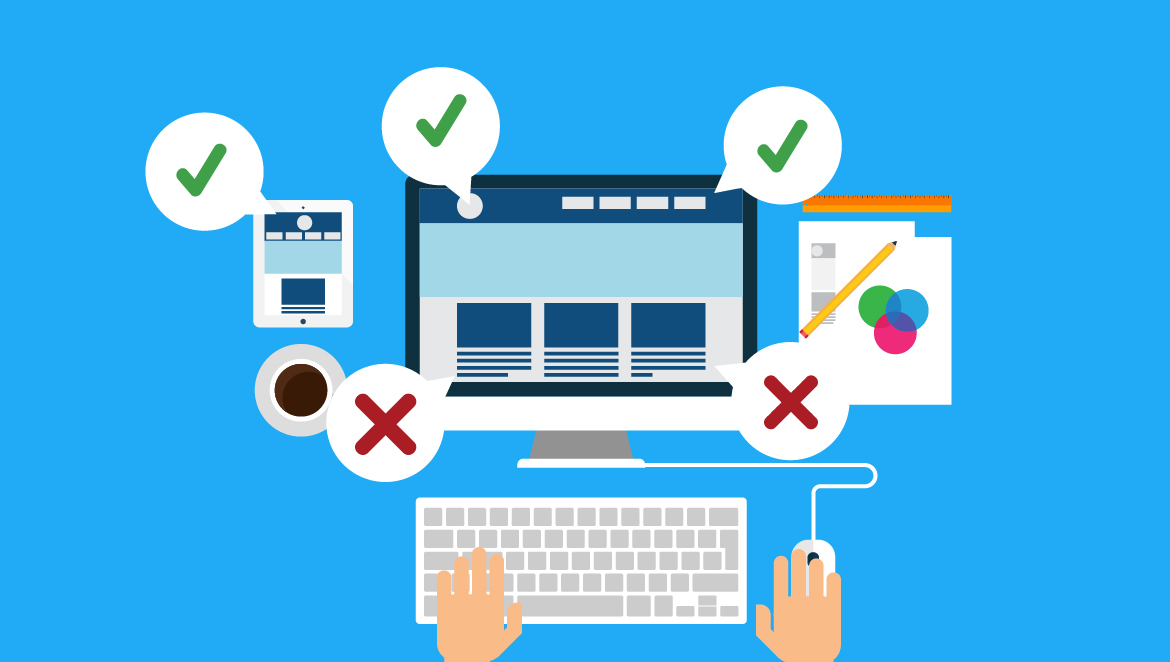
Common Responsive Design Mistakes to Avoid
Responsive design has become an essential aspect of modern web design and development. With the rise of mobile devices and the need for seamless user experiences across all devices, responsive design has become a must-have for businesses that want to stay ahead of the curve. However, as with any design project, there are some common mistakes that can be made. Here are some common responsive design mistakes to avoid:
Ignoring User Needs: The most common mistake is not considering the user’s needs when designing a responsive website or app. Designers should prioritize usability and accessibility when creating responsive layouts.
Overcomplicating Layouts: Another mistake is overcomplicating the layout of a responsive design. It is important to keep the design simple and easy to navigate on any device.
Focusing Solely on Mobile: While mobile devices are important, a responsive design should work well on all devices, including desktops and tablets.
Not Testing Properly: Designers should always test their responsive designs across different devices and browsers to ensure that the design is functional and looks great on all platforms.
Using Large Images: Large images can cause slow load times and negatively impact user experience. Designers should use optimized images and consider using progressive loading techniques to improve loading times.
Inconsistent Design: Inconsistencies in design, such as font sizes and layout, can create confusion and frustration for users. It is important to ensure that the design remains consistent across all devices.
Lack of Hierarchy: A lack of hierarchy in the design can make it difficult for users to navigate the website or app. Designers should ensure that important elements are prominent and easy to find.
By avoiding these common responsive design mistakes, designers can create designs that are not only visually appealing but also provide a seamless user experience on all devices.
Tools and Frameworks for Responsive Web Design and Development”
Responsive web design has become a crucial aspect of modern website development. With the increasing number of devices used to access websites and the internet, it’s important for websites to be optimized for all screens and sizes. Fortunately, there are many tools and frameworks available to help developers create responsive websites. In this article, we’ll explore some of the most popular tools and frameworks for responsive web design.
Bootstrap: Bootstrap is a widely used front-end development framework that offers a robust set of tools for creating responsive websites. It’s easy to use and offers pre-designed components that can be customized as needed. Bootstrap also includes a grid system that allows developers to create responsive layouts that adapt to different screen sizes.
Foundation: Foundation is another popular front-end development framework that offers a variety of tools for creating responsive websites. It includes a responsive grid system, pre-designed components, and advanced features such as interchangeable UI patterns and responsive images.
Materialize: Materialize is a responsive CSS framework based on Google’s Material Design language. It offers a variety of pre-designed components and a responsive grid system that makes it easy to create responsive layouts. Materialize also includes support for animation and advanced typography.
Semantic UI: Semantic UI is a modern CSS framework that offers a variety of pre-designed components and a responsive grid system. It’s highly customizable and offers a unique theming system that allows developers to create their own custom designs.
Susy: Susy is a lightweight grid system that allows developers to create responsive layouts without relying on pre-designed components. It’s highly flexible and allows developers to create custom grids that adapt to different screen sizes.
Flexbox: Flexbox is a CSS layout module that allows developers to create flexible and responsive layouts without relying on a grid system. It’s easy to use and offers a variety of flexible layout options.
Gridset: Gridset is a responsive design tool that allows developers to create custom grid systems that adapt to different screen sizes. It includes a variety of features such as breakpoint management, responsive typography, and a CSS generator.
In conclusion, there are many tools and frameworks available for creating responsive websites. Whether you prefer to use a pre-designed framework or create custom layouts, there’s a tool out there that can help you achieve your goals. By using these tools and following best practices for responsive design, you can create websites that look great on all devices and provide a positive user experience.
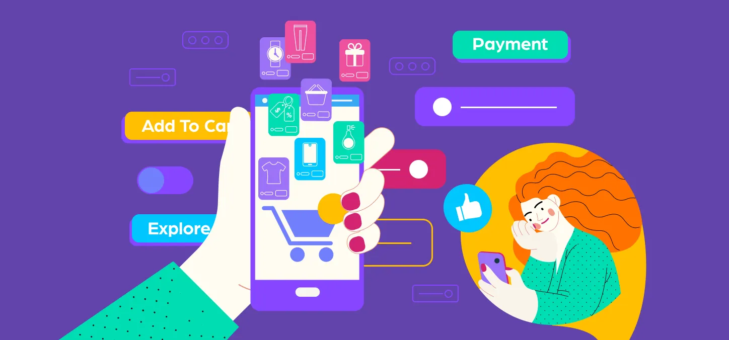
The Role of Responsive Design in E-Commerce and Online Sales
Responsive design has become increasingly important in the world of e-commerce and online sales. With more and more people using their mobile devices to shop online, it’s essential for businesses to ensure that their websites are optimized for all devices, including smartphones and tablets.
One of the main benefits of responsive design in e-commerce is that it creates a consistent user experience across all devices. This means that customers can easily navigate your website, find the products they’re looking for, and make purchases, regardless of whether they’re using a desktop computer or a mobile device.
In addition, responsive design can also improve your website’s search engine optimization (SEO). Google has stated that it prefers responsive websites over separate mobile sites, and may even penalize sites that are not optimized for mobile devices.
Responsive design can also help to increase your conversion rates and boost your sales. By creating a seamless user experience across all devices, you can reduce the likelihood of customers abandoning their shopping carts or leaving your website before making a purchase.
Another benefit of responsive design in e-commerce is that it can help to reduce your development and maintenance costs. Instead of having to create separate websites or apps for different devices, you can use a single website that adapts to different screen sizes and resolutions.
Overall, responsive design is a must-have for any e-commerce business that wants to stay competitive in today’s mobile-driven world. By creating a seamless and consistent user experience across all devices, you can improve your search rankings, boost your conversion rates, and increase your sales.
The Importance of Accessibility in Responsive Design
As the internet becomes more ingrained in our daily lives, it’s essential to ensure that websites and apps are accessible to all users, including those with disabilities. This is where responsive design comes in, as it allows for a more accessible and inclusive web experience for everyone.
Accessibility in responsive design refers to the practice of creating websites and apps that can be accessed and used by people with disabilities, such as visual, auditory, and motor impairments. By making these sites and apps accessible, we can create a more inclusive web that is available to everyone, regardless of their abilities.
Here are some ways that responsive design can help ensure accessibility:
Responsive design accommodates different screen sizes and resolutions, making it easier for people with visual impairments to access web content.
Designers can use responsive design to create websites and apps that are compatible with assistive technologies such as screen readers, magnifiers, and voice recognition software.
Responsive design allows for better navigation and interaction for users with motor impairments, such as those who use a wheelchair or have limited mobility.
Accessible design also takes into consideration the needs of users with cognitive disabilities, such as dyslexia or ADHD, by creating simple, clear, and organized layouts.
By incorporating these elements into responsive design, we can create websites and apps that are not only visually appealing but also accessible to all users. This can lead to increased engagement, satisfaction, and success for businesses and organizations.
In addition to providing a better user experience, creating accessible websites and apps is also becoming a legal requirement in many countries. For example, the Americans with Disabilities Act (ADA) in the United States requires businesses to provide accessible web content to people with disabilities.
Therefore, it’s essential to make accessibility a priority in web design and development. By using responsive design and following best practices for accessibility, we can create a more inclusive and accessible web for everyone.
Future Trends in Responsive Design: What to Expect in 2023 and Beyond
As the internet becomes an increasingly important part of our lives, responsive design has become essential for ensuring that websites are accessible and user-friendly on all devices, from desktops to smartphones. But as technology continues to evolve, what new trends can we expect to see in responsive design in the coming years? Here are some predictions for the future of responsive design:
AI and Machine Learning: As AI and machine learning become more sophisticated, they will have an increasingly important role in responsive design. These technologies will be used to analyze user behavior and adjust website layouts in real time to provide the best possible user experience.
Voice User Interface: As voice assistants like Siri and Alexa become more popular, designers will need to consider how to optimize websites for voice user interfaces. This means creating sites that can be navigated by voice and that provide information in a format that is easy to understand when read aloud.
Augmented Reality: Augmented reality (AR) is already being used in a variety of applications, from gaming to shopping. In the future, it will play a larger role in responsive design by allowing designers to create immersive experiences that bridge the gap between the physical and digital worlds.
Variable Fonts: Variable fonts allow designers to create custom typography that adjusts in real time to fit the user’s device and screen size. This means that fonts will no longer need to be selected manually, but will instead adapt to the user’s needs and preferences.
Motion Design: Motion design is already a popular trend in responsive design, but it will continue to grow in importance in the coming years. As websites become more interactive, motion design will be used to create engaging and dynamic experiences that keep users coming back for more.
5G Technology: As 5G technology becomes more widely available, it will have a significant impact on responsive design. Websites will be able to load faster and provide more seamless experiences, making it easier for users to access the content they need on the go.
Inclusive Design: Inclusive design ensures that websites are accessible to all users, including those with disabilities. In the future, designers will need to consider a wider range of accessibility issues, such as color blindness and cognitive disabilities, and ensure that their websites are designed to accommodate these needs.
In conclusion, responsive design is an ever-evolving field that is constantly changing to meet the needs of users and the demands of new technologies. By staying up-to-date with the latest trends and best practices, designers can create websites that are not only beautifuland functional, but also accessible and user-friendly for all.
Motion graphics have become an integral part of many design projects, from advertising and marketing to film and television. As technology advances and creative possibilities expand, the future of motion graphics is constantly evolving. In this article, we will explore some of the predicted trends and innovations that are shaping the future of motion graphics.
Interactive Motion Graphics
Interactive motion graphics refer to animations that respond to user input, creating an engaging and dynamic experience. This type of motion graphics is used in a variety of settings, including websites, mobile apps, and digital advertisements.
Interactive motion graphics often involve user interactions such as clicking, swiping, or scrolling. These interactions trigger animations, visual effects, or changes in the design that make the experience more immersive and engaging. This approach is particularly effective for explaining complex concepts, storytelling, and creating memorable brand experiences.
To create interactive motion graphics, designers typically use a combination of software tools, such as Adobe After Effects, Adobe Animate, and HTML5. They also need to have a solid understanding of UX design principles and animation techniques.
The benefits of using interactive motion graphics include increased user engagement, improved brand recognition, and better retention of information. Interactive motion graphics can also be used for gamification, creating fun and interactive experiences that encourage user participation.
To ensure the success of an interactive motion graphics project, it is important to conduct thorough user research and testing. This helps to identify user needs and preferences, as well as potential issues that may affect the user experience.
3D Motion Graphics
3D motion graphics is a type of animation that involves the use of three-dimensional graphics and objects to create motion graphics. Unlike traditional 2D motion graphics, 3D motion graphics can give a sense of depth and realism, which makes them ideal for creating animations for video games, movies, and other media.
There are various techniques and tools used for creating 3D motion graphics, including modeling, texturing, rigging, and animation. Some popular software used in 3D motion graphics include Cinema 4D, Maya, 3D Studio Max, and Blender.
When creating 3D motion graphics, it’s important to keep in mind the principles of design, including composition, color, and typography. These elements can help to create a visually appealing and effective animation.
In recent years, there has been a growing demand for 3D motion graphics in various industries, including advertising, entertainment, and education. As technology continues to advance, it’s likely that 3D motion graphics will become even more advanced and widely used in the future.
Personalized Motion Graphics
Personalized motion graphics are an innovative way to connect with your audience on a more personal level. By customizing the visuals and messaging of your motion graphics, you can create a more engaging and memorable experience for your viewers.
In this article, we’ll explore the concept of personalized motion graphics and how they can benefit your brand. We’ll also provide some tips on how to create effective personalized motion graphics.
What are Personalized Motion Graphics?
Personalized motion graphics are motion graphics that are customized to meet the specific needs and preferences of individual viewers. This can be done by incorporating the viewer’s name, location, or other personal information into the graphics.
Personalized motion graphics are becoming increasingly popular as brands look for new ways to engage with their audiences. By making your motion graphics more personal, you can create a deeper connection with your viewers and increase the chances of them engaging with your brand.
Benefits of Personalized Motion Graphics
There are several benefits to using personalized motion graphics for your brand. These include:
Increased Engagement: Personalized motion graphics are more likely to capture the attention of viewers and keep them engaged for longer.
Improved Brand Perception: Personalized motion graphics show that your brand is invested in creating a more personal connection with its audience, which can improve brand perception.
Higher Conversion Rates: Personalized motion graphics can increase conversion rates by providing a more targeted and personalized message to your viewers.
Tips for Creating Effective Personalized Motion Graphics
Here are some tips for creating effective personalized motion graphics:
Use Data Wisely: Use data to inform your personalized motion graphics, but don’t rely on it too heavily. Remember that your audience is made up of individuals, and not all of them will fit into the same category.
Keep it Simple: Personalization doesn’t have to be complicated. Something as simple as incorporating the viewer’s name into the graphics can be effective.
Be Creative: Use personalized motion graphics as an opportunity to be creative and stand out from your competition.
Test and Iterate: Test your personalized motion graphics with different audiences and iterate based on their feedback.
Immersive Motion Graphics
Immersive motion graphics are a type of motion graphics that use cutting-edge technology to create a more immersive and interactive experience for the viewer. These types of motion graphics often incorporate elements such as virtual reality, augmented reality, and 360-degree video to create a fully immersive environment.
Creating immersive motion graphics requires a combination of technical skill, creativity, and an understanding of how to use technology to enhance the viewer experience. Here are some key elements to consider when creating immersive motion graphics:
Interactivity: Immersive motion graphics should be interactive, allowing the viewer to interact with the environment and influence the outcome of the experience. This could be through the use of motion sensors, touch screens, or other interactive elements.
Storytelling: Immersive motion graphics should also tell a story, whether that be through a narrative, a series of visuals, or an interactive experience. The story should be engaging and help to draw the viewer into the immersive environment.
Technology: Immersive motion graphics often require the use of cutting-edge technology such as virtual reality headsets, augmented reality apps, and 360-degree cameras. It’s important to have a strong understanding of these technologies and how to use them to create the desired effect.
Design: Design is key when creating immersive motion graphics, as it can greatly impact the viewer experience. It’s important to create visually stunning graphics that are easy to navigate and understand, while also being visually engaging and immersive.
Collaboration: Creating immersive motion graphics often requires collaboration between designers, developers, and other experts in various fields. It’s important to have a strong team in place to ensure that all elements are working together seamlessly.
Real-time Motion Graphics
Real-time motion graphics refer to animations or graphics that are generated on the fly, rather than being pre-rendered. Real-time motion graphics are commonly used in interactive media, such as video games and live events, to create immersive and responsive visual experiences.
Artificial Intelligence and Motion Graphics
Artificial Intelligence (AI) is changing the world in countless ways, and the field of motion graphics is no exception. With the ability to analyze data and identify patterns, AI is helping motion designers create new and innovative visual effects.
One of the most significant impacts of AI on motion graphics is the ability to automate certain tasks. For example, AI-powered tools can analyze video footage and automatically track objects, eliminating the need for manual tracking. This can save designers a significant amount of time and effort, allowing them to focus on more creative tasks.
AI is also being used to create more realistic and immersive motion graphics. For example, AI algorithms can analyze real-world physics and apply them to virtual objects, creating more natural movements and interactions. This can help create more engaging and believable animations and simulations.
Another area where AI is having an impact is in the creation of personalized and interactive motion graphics. With the ability to analyze user data, AI can create personalized animations and visualizations that are tailored to individual users. Additionally, AI-powered tools can create interactive motion graphics that respond to user input, creating a more engaging and immersive experience.
As AI technology continues to advance, we can expect to see even more exciting developments in the field of motion graphics. From automated tasks to personalized and interactive animations, the possibilities are endless.
Minimalistic Motion Graphics
Minimalistic motion graphics, also known as minimal motion design, is a design style that emphasizes simplicity and uses a minimal amount of elements to create a visually striking composition. The aim of minimalistic motion graphics is to convey the intended message with minimal distraction, using only the essential elements needed to convey the message.
Minimalistic motion graphics often use clean lines, geometric shapes, and limited color palettes to create a sense of order and simplicity. By focusing on essential elements, minimalistic motion graphics can be effective in capturing the viewer’s attention and conveying a message quickly and effectively.
The use of minimalistic motion graphics has been on the rise in recent years, with designers utilizing this style to create a wide range of content, from explainer videos to product promos. In addition, minimalistic motion graphics can be used to enhance user experience, such as in website design or in the creation of user interfaces.
Animated Typography
Animated typography, also known as kinetic typography, is the art of animating text in a way that adds visual interest and enhances the overall message of a design project. By adding movement and animation to typography, designers can create engaging visuals that capture the attention of viewers and communicate important information in a more dynamic way.
Animated typography can take on many different forms, from simple text animations that highlight individual words or phrases, to more complex motion graphics that incorporate typography into a larger design concept. Some common techniques used in animated typography include keyframe animation, masking, and motion blur, among others.
When designing with animated typography, it’s important to keep in mind the overall tone and message of the project. The animation should enhance the message, not distract from it. It’s also important to consider the audience and the medium in which the animation will be viewed, as this can impact the style and format of the animation.
Incorporating animated typography into a design project can add a level of creativity and visual interest that static typography cannot achieve. By using movement and animation to draw attention to key messages, designers can create more memorable and impactful designs that leave a lasting impression on viewers.
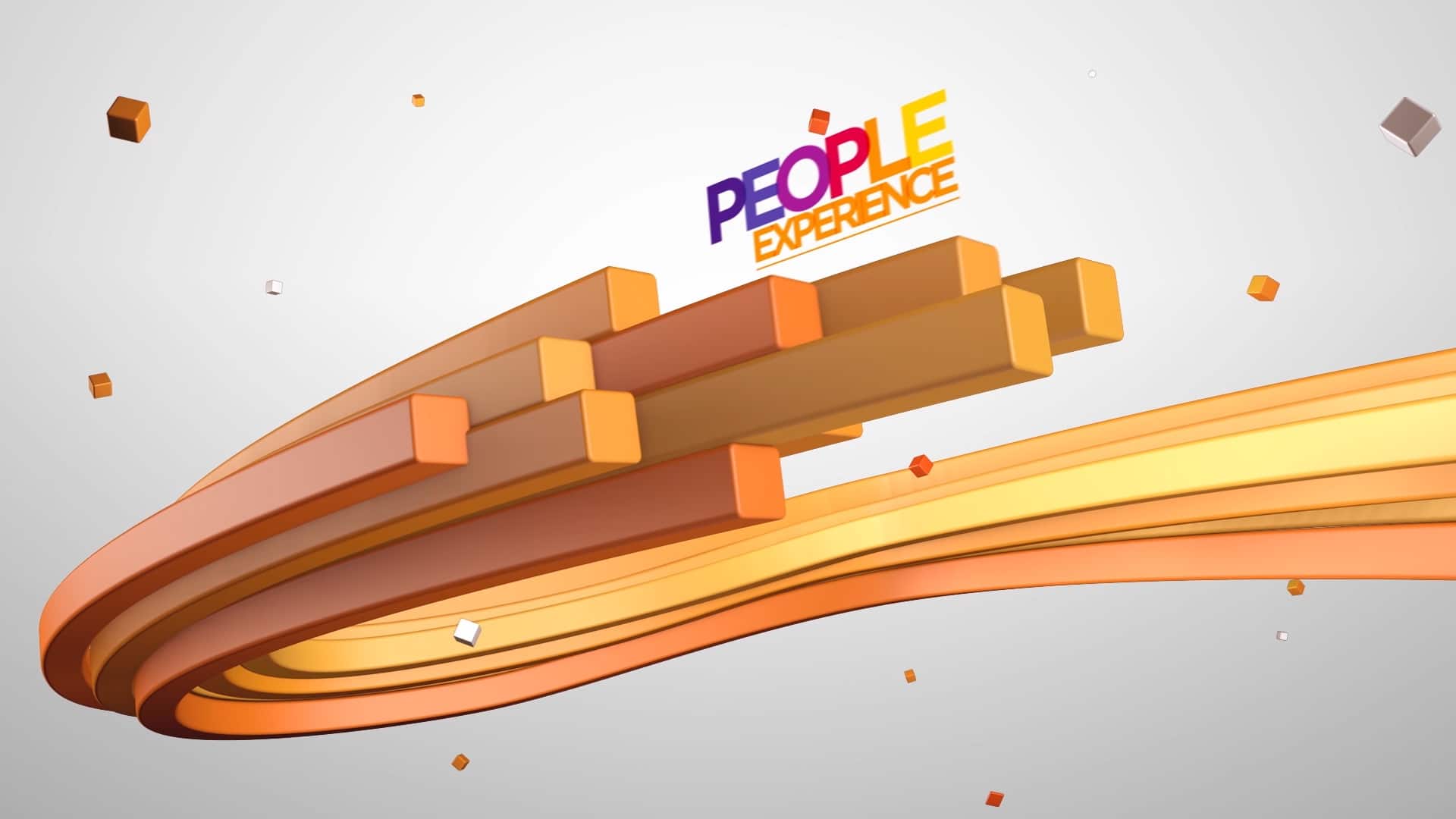
Kinetic Logos and Branding
Kinetic logos and branding refer to the use of motion graphics and animation to bring a brand’s visual identity to life. By incorporating movement and dynamic effects into a logo, brand mark, or other visual elements, designers can create a more engaging and memorable brand experience for customers.
Kinetic logos and branding can take many forms, from subtle animations that add a touch of life to a static logo, to more complex motion graphics that fully reimagine a brand’s visual identity. Some popular examples of kinetic logos and branding include:
Animated logos that feature moving elements, transitions, or transformations
Interactive branding experiences that allow users to engage with a brand’s visual identity through gestures or other inputs
Motion graphics that visualize a brand’s messaging or core values through dynamic effects and animation
Kinetic logos and branding can be especially effective for brands that want to stand out in a crowded marketplace and create a strong emotional connection with their audience. By using animation and motion graphics in creative and unexpected ways, designers can help a brand capture attention and convey its personality, values, and story more effectively than static imagery alone.
Some potential benefits of using kinetic logos and branding include increased brand recognition, improved user engagement and retention, and enhanced storytelling capabilities. However, it’s important to balance these benefits with considerations around usability, accessibility, and technical feasibility, as overly complex or resource-intensive animations can have a negative impact on user experience.
Hybrid Motion Graphics and Live-action
Hybrid motion graphics and live-action is a popular trend in the world of video production and motion graphics. It involves the combination of live-action footage with animated or motion graphics elements to create a visually stunning and engaging video.
There are several benefits of using hybrid motion graphics and live-action in video production. Firstly, it allows you to showcase your brand in a unique and memorable way. By combining live-action footage with motion graphics, you can create a cohesive brand image that is both visually striking and informative.
Secondly, it offers a level of versatility that is not available with either live-action or motion graphics alone. By combining the two, you can create a wide range of visual styles and effects, from realistic to surreal and everything in between.
To create effective hybrid motion graphics and live-action videos, it is important to carefully plan and storyboard your ideas. This involves deciding on the overall style and tone of your video, as well as the specific elements you want to include, such as typography, color schemes, and special effects.
You will also need to consider the technical aspects of video production, such as lighting, camera angles, and sound design. By paying attention to these details, you can create a seamless and immersive viewing experience for your audience.
Some popular examples of hybrid motion graphics and live-action in video production include movie title sequences, commercials, and promotional videos for products and services.
If you are interested in incorporating hybrid motion graphics and live-action into your video production, it is important to work with a skilled and experienced team of professionals who can help bring your vision to life.
Social media has become a vital part of digital marketing, and the competition to grab the attention of users is increasing day by day. Creating engaging social media graphics is one effective way to stand out and drive traffic to your website or product. Here are some tips on how to create engaging social media graphics that can help you increase your reach and visibility.
Keep it simple and visually appealing: Simple designs that are visually appealing and easy to read will grab the attention of users.
Use high-quality images: Using high-quality images in your social media graphics can make a significant impact on engagement rates.
Incorporate branding: Incorporate your brand’s colors, fonts, and logos to increase brand awareness and recognition.
Add text overlays: Adding text overlays to your images can help communicate your message more effectively and make your graphics stand out.
Use animation: Animating your graphics can increase engagement rates and add an element of fun.
Keep it consistent: Consistency is key to building brand recognition, so keep your social media graphics consistent with your brand’s overall look and feel.
Make it shareable: Make sure your graphics are easy to share across different social media platforms to increase your reach.
Use infographics: Infographics are a great way to share complex information in an easy-to-understand format.
Include a call to action: Including a call to action in your social media graphics can encourage users to take action, such as visiting your website or signing up for your newsletter.
Test and analyze: Test different graphics and analyze the results to see what works best for your audience and adjust your strategy accordingly.
Negative space, also known as white space, is the area surrounding the main subject or image in a design. It is often overlooked, but when used creatively, negative space can have a powerful impact on the overall design. In this article, we will explore 10 creative uses for negative space in design.
Creating Shapes
Negative space can be used to create shapes that add depth and complexity to a design. By using the negative space around a main subject, designers can create new shapes that draw the eye and add visual interest.
Logo Design
Negative space is often used in logo design to create a memorable and unique logo. By using negative space, designers can create logos that have hidden meanings or messages, making them more memorable and engaging.
Typography
Negative space can be used in typography to create interesting and unique letterforms. By using the negative space between letters, designers can create letterforms that are more dynamic and visually appealing.
Illustration
Negative space can be used in illustration to create depth and interest. By using negative space, designers can create illustrations that are more complex and visually interesting.
Photography
Negative space can be used in photography to create a sense of scale and depth. By using negative space, photographers can create images that are more visually striking and engaging.
Packaging Design
Negative space can be used in packaging design to create a sense of luxury and sophistication. By using negative space, designers can create packaging that feels more premium and high-end.
Web Design
Negative space can be used in web design to create a clean and modern look. By using negative space, designers can create websites that are more visually appealing and user-friendly.
Advertising
Negative space can be used in advertising to create a memorable and impactful message. By using negative space, designers can create ads that are more visually striking and engaging.
Artwork
Negative space can be used in artwork to create a sense of depth and movement. By using negative space, artists can create artwork that is more visually dynamic and interesting.
Book Design
Negative space can be used in book design to create a more engaging and visually interesting layout. By using negative space, designers can create books that are more visually appealing and easier to read.
In conclusion, negative space is a powerful tool in design that can be used in many creative ways. By using negative space, designers can create more visually interesting and impactful designs. Experimenting with negative space can lead to unique and memorable designs that stand out in a crowded market.
In recent years, minimalism has become one of the most popular design styles. This design philosophy has infiltrated everything from product design to architecture, and graphic design is no exception. As we move into 2023, minimalism is poised to continue its ascent as a major trend in graphic design. In this article, we’ll take a closer look at the impact of minimalism on graphic design and how it’s likely to shape the industry in the coming years.
Minimalism is a design philosophy that emphasizes simplicity and the use of a limited color palette. It involves stripping away unnecessary elements, leaving only what is essential to communicate the intended message. The result is a clean, uncluttered design that is both visually appealing and easy to understand.
One of the main reasons why minimalism has become so popular in graphic design is because it allows for better communication. By removing unnecessary elements, the message of the design becomes more clear and focused. This is particularly important in today’s fast-paced world where people are constantly bombarded with information. A minimalistic design stands out and grabs attention precisely because it is so different from the cluttered and chaotic designs that dominate the landscape.
Another reason why minimalism is so popular is that it is highly versatile. Minimalist designs can be used in a variety of contexts, from product packaging to branding to website design. In fact, many of the world’s biggest brands, such as Apple and Nike, have embraced minimalism in their marketing and branding efforts. By using a consistent, minimalist design aesthetic across all of their marketing materials, they are able to create a strong and instantly recognizable brand identity.
As we move into 2023, we can expect to see minimalism continue to play a major role in graphic design. With the rise of mobile devices and the increasing importance of responsive design, minimalism is a natural fit. Minimalistic designs are easy to scale and adapt to different screen sizes, making them perfect for mobile devices. Additionally, minimalism is highly effective in creating user-friendly interfaces, which is essential for website and app design.
In conclusion, the impact of minimalism on graphic design in 2023 is likely to be significant. As designers continue to search for ways to communicate more effectively in our fast-paced world, minimalism offers a powerful tool for doing just that. By simplifying designs and focusing on what is essential, designers can create highly effective and visually appealing designs that are sure to stand out in a crowded marketplace.
Creating a design portfolio is a crucial step for any aspiring or professional designer. It showcases your skills, creativity, and style to potential clients or employers. In this article, we’ll explore some tips and best practices to create a successful design portfolio.
Define your niche: Before creating a portfolio, it’s essential to identify your niche. Do you specialize in branding, web design, or illustration? Once you define your niche, it becomes easier to curate your work and attract the right clients.
Showcase your best work: Your portfolio should highlight your best work. Choose projects that showcase your skills and expertise. Ensure that each project is unique and demonstrates your creative problem-solving abilities.
Provide context: Provide context for each project in your portfolio. Explain the challenge you faced and how you overcame it. This context helps potential clients or employers understand your approach and problem-solving abilities.
Keep it simple: Your portfolio should be easy to navigate and understand. Avoid clutter and focus on showcasing your work. Keep the design minimalistic, and let your work speak for itself.
Include your process: Including your process in your portfolio can be beneficial. It helps clients or employers understand how you work and what to expect from you. Share sketches, mockups, and prototypes to demonstrate your process.
Make it responsive: Ensure that your portfolio is responsive and works well on different devices. Most clients or employers browse portfolios on their mobile devices, so it’s essential to make your portfolio mobile-friendly.
Update regularly: Update your portfolio regularly with new projects and remove outdated work. Keep your portfolio fresh and relevant to showcase your growth and progress as a designer.


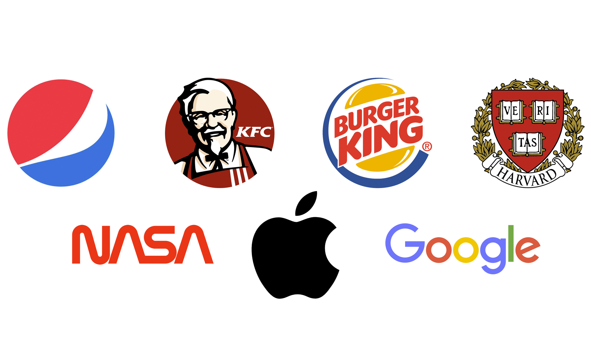
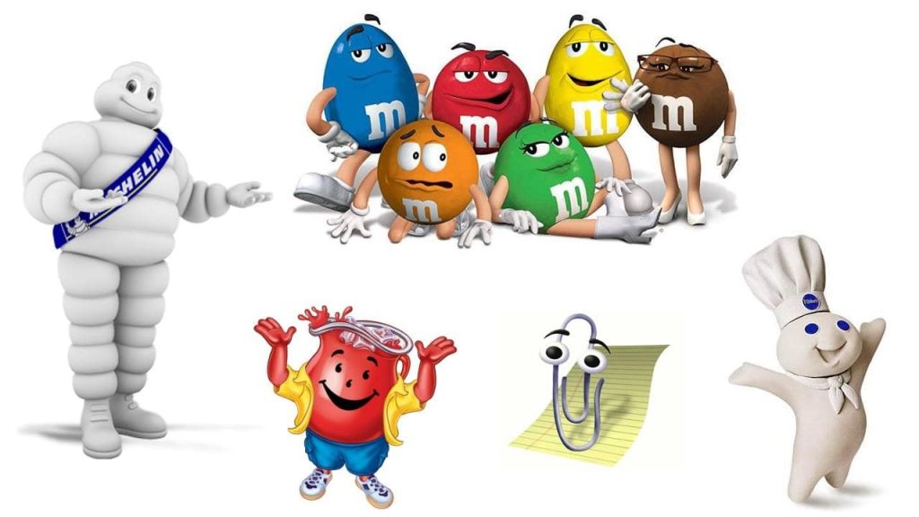


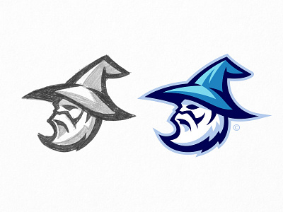
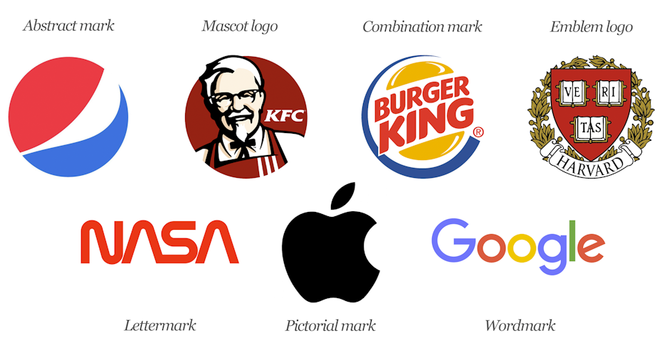


