Exploring the different types of design software and their uses

Design software is essential for anyone in the graphic design industry, as it enables the creation of visually stunning graphics, illustrations, and layouts. With the wide variety of design software available, it can be overwhelming to choose the right tool for the job. In this article, we’ll explore the different types of design software and their uses, so you can select the perfect software for your design needs.

Vector Graphics Software: Vector graphics software is ideal for creating illustrations, logos, and other graphics that require clean lines and crisp edges. Adobe Illustrator, CorelDRAW, and Inkscape are popular examples of vector graphics software.

Photo Editing Software: Photo editing software is used for manipulating and enhancing digital photographs. Adobe Photoshop, GIMP, and Affinity Photo are common photo editing software programs.

Page Layout Software: Page layout software is used for designing page layouts for printed materials such as magazines, books, and brochures. Adobe InDesign and QuarkXPress are popular page layout software programs.

3D Design Software: 3D design software is used for creating 3D models, animations, and visual effects. Autodesk Maya, Blender, and Cinema 4D are common 3D design software programs.

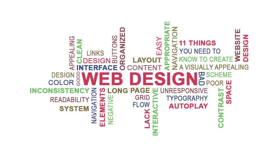
Web Design Software: Web design software is used for designing and creating websites. Adobe Dreamweaver, Wix, and WordPress are popular web design software programs.

When selecting design software, it’s important to consider your specific design needs, the learning curve of the software, and your budget. Additionally, it’s worth noting that some software programs offer more advanced features and capabilities than others, so it’s important to choose a program that aligns with your skill level and design goals.

How to design for accessibility and inclusivity

Designing for accessibility and inclusivity is a crucial aspect of graphic design. It involves creating designs that are easy to access, understand, and use by individuals with diverse abilities, including those with disabilities. In this article, we’ll explore tips and best practices for designing accessible and inclusive designs.

Understand your audience

The first step in designing for accessibility and inclusivity is to understand your audience. You need to have a clear idea of who your design is intended for and their specific needs. This includes individuals with visual impairments, hearing impairments, cognitive impairments, and physical disabilities.

Use clear and legible fonts

Using clear and legible fonts is important for individuals with visual impairments. Avoid using decorative fonts and stick to simple and easy-to-read fonts like Arial, Helvetica, or Verdana. Make sure the font size is big enough and has enough contrast with the background color.

Use color thoughtfully

Color can be a powerful tool in design, but it can also create accessibility issues. Ensure that the color contrast between the background and text is sufficient to make it readable for everyone. Use color combinations that are easily distinguishable for individuals with color blindness.

Provide alternative text for images

Alternative text (alt text) is a brief description of an image that is read aloud by screen readers for individuals with visual impairments. Make sure to provide alt text for all images and keep it concise and descriptive.

Use descriptive headings and labels

Using descriptive headings and labels can help individuals with cognitive impairments and screen readers to understand the content better. Make sure your headings are clear and informative, and your labels are descriptive and meaningful.

Test your design

Testing your design with individuals with disabilities is essential to ensure its accessibility and inclusivity. It helps you identify any accessibility barriers and make the necessary changes. You can also use accessibility tools and guidelines to test your design.

In conclusion, designing for accessibility and inclusivity is an important aspect of graphic design. It ensures that your designs are accessible and understandable to everyone, regardless of their abilities. By following these tips and best practices, you can create designs that are not only visually stunning but also inclusive and accessible to all.

Using contrast in graphic design: Best practices and examples

Contrast is a powerful tool in graphic design that can create visual interest and guide the viewer’s eye. It involves using differences in color, size, shape, and texture to create a visual hierarchy and emphasis. In this article, we will discuss best practices and examples for using contrast in graphic design.

  1. Create a focal point: Use contrast to create a focal point that draws the viewer’s eye. This could be a bright color, large font, or bold image. The focal point should be the most important element on the page and should guide the viewer’s attention.
  2. Use contrasting colors: Use contrasting colors to create visual interest and emphasis. This could be as simple as using black and white or complementary colors. High contrast colors such as black and white or red and green are particularly effective for creating emphasis.
  3. Contrast font sizes: Use different font sizes to create contrast and hierarchy. Larger font sizes should be used for headings and important information, while smaller font sizes can be used for supporting text.
  4. Contrast font weights: Use different font weights to create contrast and emphasis. Bold fonts can be used for headings and important information, while lighter weights can be used for supporting text.
  5. Use contrasting shapes: Use contrasting shapes to create visual interest and emphasis. For example, a circular shape could be used to contrast against a square shape.
  6. Use contrasting textures: Use contrasting textures to create visual interest and emphasis. This could be as simple as using a smooth texture next to a rough texture.
  7. Keep it simple: Avoid using too many contrasting elements, as this can create confusion and visual clutter. Keep it simple and focus on creating a clear hierarchy and focal point.

Examples of using contrast in graphic design:

  • A black and white photograph with a pop of color in the foreground creates a focal point and draws the viewer’s eye.
  • Using a bold font for a heading and a lighter font for supporting text creates contrast and hierarchy.
  • Using a large image with a small amount of text creates contrast and emphasizes the visual element.
  • Using contrasting colors such as red and green for a call to action creates emphasis and draws the viewer’s attention.

In conclusion, contrast is a powerful tool in graphic design that can create visual interest and guide the viewer’s eye. By using contrasting colors, font sizes, shapes, and textures, designers can create a clear hierarchy and emphasis. By keeping it simple and focusing on a clear focal point, designers can effectively use contrast to create stunning designs.

Tips for creating stunning infographics

Infographics are a great way to convey complex information in a visually appealing and easily digestible format. They combine design elements with data-driven insights to create a powerful communication tool. However, creating an effective infographic can be challenging. In this article, we will discuss some tips for creating stunning infographics.

  1. Define your purpose and audience: Before you start designing your infographic, it’s important to define your purpose and audience. Ask yourself what message you want to convey and who your target audience is. This will help you decide on the appropriate tone, style, and level of complexity for your infographic.
  2. Choose a clear and concise topic: Choose a topic that is focused and specific. Avoid trying to cover too much information in one infographic. Instead, break down the information into smaller, more manageable pieces.
  3. Gather relevant data: Research and gather relevant data that supports your topic. Make sure the data is accurate and from a reliable source.
  4. Create a hierarchy of information: Organize your information in a clear and logical hierarchy. Use headings, subheadings, and bullet points to make the information easier to read and understand.
  5. Use visuals to support your message: Use visuals such as charts, graphs, icons, and images to support your message. Visuals can make complex information easier to understand and remember.
  6. Choose a color scheme: Choose a color scheme that complements your topic and supports your message. Use contrasting colors to highlight important information and create visual interest.
  7. Use typography effectively: Use typography to create hierarchy, emphasis, and contrast. Choose fonts that are easy to read and use different font weights and sizes to create visual interest.
  8. Keep it simple: Avoid cluttering your infographic with too much information or design elements. Keep it simple and focused on the key message.
  9. Test and revise: Test your infographic with your target audience and revise it based on their feedback. Make sure it’s easy to understand and visually appealing.

In conclusion, creating stunning infographics requires careful planning, organization, and design skills. By following these tips, you can create infographics that effectively communicate your message and engage your audience.

How to create custom illustrations using Adobe Illustrator

Custom illustrations are a great way to add a unique and personalized touch to your design projects. Adobe Illustrator is a powerful tool for creating vector-based illustrations that can be used in various mediums such as print and digital media. In this article, we will go through the steps of creating custom illustrations using Adobe Illustrator.

Step 1: Sketch Your Idea

Before starting with the software, it’s always good to have a rough sketch of your idea. Sketching helps you visualize your idea and plan your composition. You can use a pencil and paper or digital sketching software such as Adobe Sketch to create your initial concept.

Step 2: Create a New Document in Adobe Illustrato

Open Adobe Illustrator and create a new document. Make sure to set your document size and resolution based on your project’s requirements.

Step 3: Create Basic Shapes

Start creating basic shapes using the shape tools in Illustrator. You can create different shapes such as circles, rectangles, and triangles. These shapes can be used as a base for your illustration.

Step 4: Add Details to Your Shapes

Use the Pen tool in Illustrator to add details to your shapes. You can create curves and lines to make your shapes more interesting. You can also use the Pathfinder tool to combine shapes and create new shapes.

Step 5: Use the Color Palette

Choose a color palette that fits your project and use it to fill in your shapes. You can use the Swatches panel in Illustrator to save your color palette for future use.

Step 6: Add Depth and Texture

Adding depth and texture to your illustrations can make them look more realistic. You can use the Gradient tool to add depth to your shapes. You can also use the Texture panel in Illustrator to add texture to your illustrations.

Step 7: Refine Your Illustration

Once you’ve added all the details, take a step back and look at your illustration. Make sure it’s balanced and visually appealing. You can also adjust the colors and shapes to refine your illustration.

Step 8: Save Your Illustration

Once you’re happy with your illustration, save it in a format that suits your project. You can save it as a vector file or as a high-resolution PNG or JPEG file.

Creating custom illustrations using Adobe Illustrator takes practice, but with these steps, you can get started on your own illustrations. Remember to sketch your idea first, create basic shapes, add details and color, and refine your illustration until it’s visually appealing. Using custom illustrations in your design projects can make them more unique and personalized.

Designing for print: Best practices and considerations

Designing for print can be a complex and challenging process. Unlike digital design, print design requires careful attention to detail and a deep understanding of the printing process. In this article, we will explore best practices and considerations for designing for print.

  1. Choose the right format: The first step in designing for print is choosing the right format for your project. This includes selecting the appropriate paper size, page orientation, and bleed area. It’s important to work closely with your printer to ensure that your design meets their specifications.
  2. Use high-resolution images: When designing for print, it’s important to use high-resolution images to ensure that your design looks sharp and professional. Make sure to use images with a resolution of at least 300 DPI (dots per inch) for the best results.
  3. Pay attention to color: Color is a crucial aspect of print design, and it’s important to use the right color profiles and settings to ensure that your colors look accurate and vibrant. Work closely with your printer to choose the right color profile for your project, and be sure to proof your design carefully to ensure that colors look consistent across different devices and lighting conditions.
  4. Consider typography: Typography plays a key role in print design, and it’s important to choose fonts that are legible and appropriate for your project. Make sure to select fonts with a variety of weights and styles to create a hierarchy of information and make your design more visually interesting.
  5. Pay attention to margins and spacing: Proper margins and spacing are crucial in print design, as they ensure that your design looks balanced and professional. Make sure to use consistent spacing throughout your design, and pay close attention to the margins around your text and images to ensure that everything looks properly aligned.
  6. Proofread carefully: Finally, it’s essential to proofread your design carefully to ensure that there are no errors or typos. This includes checking for spelling and grammar mistakes, as well as making sure that all text is properly aligned and formatted.

In conclusion, designing for print requires careful attention to detail and a deep understanding of the printing process. By choosing the right format, using high-resolution images, paying attention to color and typography, and proofreading carefully, you can create print designs that look sharp, professional, and visually appealing.

The benefits of using mockups in your design projects

Mockups are an important tool in the world of graphic design. They are essentially digital representations of your design projects, which can be used to showcase your work to clients or to get a better idea of how your design will look in the real world. In this article, we will explore the benefits of using mockups in your design projects.

  1. Presenting designs to clients: One of the biggest benefits of using mockups is that they allow you to present your designs to clients in a clear and visually appealing way. By using a mockup, clients can get a better idea of how the final product will look, which can help you to win more business.
  2. Testing design concepts: Mockups are a great way to test different design concepts before committing to a final design. This allows you to see how different colors, fonts, and layouts will work together, and to make any necessary changes before finalizing your design.
  3. Saving time and money: Using mockups can save you time and money in the long run. By testing different design concepts and getting feedback from clients early on, you can avoid costly revisions later on in the design process.
  4. Enhancing collaboration: Mockups are also great for enhancing collaboration between designers and clients. By sharing mockups with clients, you can get feedback and make changes in real-time, which can help to streamline the design process.
  5. Creating a professional portfolio: Using mockups to showcase your work can help you to create a more professional-looking portfolio. By presenting your designs in a visually appealing way, you can make a stronger impression on potential clients and employers.
  6. Improving design accuracy: Mockups can also help to improve the accuracy of your designs. By seeing your designs in a real-world context, you can spot any potential issues or design flaws before they become a problem.

In conclusion, mockups are a valuable tool in any graphic designer’s toolkit. By using mockups, you can present your designs to clients in a clear and visually appealing way, test different design concepts, save time and money, enhance collaboration, create a professional portfolio, and improve design accuracy.

How to design a website from scratch

Designing a website from scratch can be a daunting task, but it’s an essential step for any business or individual looking to establish an online presence. In this article, we will guide you through the process of designing a website from scratch.

  1. Define your website’s purpose and audience: Before you start designing, it’s important to understand why you need a website and who your target audience is. This will inform the design choices you make throughout the process.
  2. Plan your website structure: Decide on the pages you need and how they will be organized. This will help you create a clear and easy-to-navigate website.
  3. Choose a website platform: There are many website platforms available, each with their own strengths and weaknesses. Choose a platform that suits your needs and skill level.
  4. Select a template or create your own: Most website platforms offer pre-designed templates that can be customized to fit your needs. Alternatively, you can create your own design from scratch using tools like Adobe Photoshop or Sketch.
  5. Choose your color scheme: Your color scheme should reflect your brand’s personality and help create a cohesive design. Use colors that complement each other and are easy on the eyes.
  6. Create a logo: Your logo is an essential part of your brand identity and should be prominently displayed on your website. Use a high-quality image and make sure it’s easily recognizable.
  7. Design your website layout: Use your website plan to design a layout that is easy to navigate and visually appealing. Use whitespace to create a clean, uncluttered design.
  8. Add images and graphics: Use high-quality images and graphics to add visual interest to your website. Make sure they are relevant to your content and optimized for web use.
  9. Choose your fonts: Your font choices should be easy to read and reflect your brand’s personality. Use no more than three fonts to keep your design consistent and cohesive.
  10. Test and launch your website: Before launching your website, make sure to test it thoroughly to ensure it functions properly and looks good on different devices and screen sizes.

In conclusion, designing a website from scratch requires careful planning and attention to detail. By following these steps, you can create a website that effectively communicates your message, engages your audience, and helps establish your online presence.

Designing for social media: Tips and best practices

Social media has become a crucial platform for businesses and individuals to connect with their audience and promote their brand. However, with so much content being shared every day, it’s important to make sure your social media posts stand out from the crowd. In this article, we will discuss some tips and best practices for designing for social media.

  1. Choose the right platform: Different social media platforms have different requirements and limitations when it comes to image and video sizes. It’s important to research and understand the guidelines for each platform to ensure your designs are optimized for that platform.
  2. Keep it simple: Social media is a fast-paced environment, and users scroll quickly through their feeds. Keep your designs simple and to the point, using bold imagery and clear text to convey your message.
  3. Consistency is key: Use consistent branding elements across all of your social media posts to create a cohesive and recognizable brand identity. Use the same fonts, colors, and imagery to establish brand recognition.
  4. Use high-quality visuals: Visuals are the heart of social media, and it’s important to use high-quality visuals that are engaging and eye-catching. Use images and videos that are clear, well-lit, and visually interesting.
  5. Incorporate text overlays: Text overlays can help convey your message and make your designs more engaging. Use bold, easy-to-read fonts and concise messaging to communicate your message effectively.
  6. Be mindful of typography: As discussed in our previous article, typography plays a critical role in graphic design. Choose fonts that are legible and reflect your brand’s personality.
  7. Design for mobile: More and more users access social media from their mobile devices, so it’s important to design with mobile in mind. Use designs that are easily viewable on smaller screens and ensure that your text is large enough to be read on a mobile device.
  8. Test your designs: Finally, it’s important to test your designs before posting them to ensure they look good and function properly on the platform you’re using. Test your designs on different devices and screen sizes to ensure they are optimized for all users.

In conclusion, designing for social media requires a different approach than traditional graphic design. By understanding the unique requirements and best practices for social media design, you can create engaging, eye-catching content that resonates with your audience and promotes your brand.

The role of typography in graphic design

Typography is a critical aspect of graphic design. It is the art of arranging type in a way that enhances the readability, legibility, and overall aesthetic of a design. Typography can help establish the tone and personality of a brand, convey information, and create a sense of hierarchy in a design. In this article, we will discuss the role of typography in graphic design.

Legibility

Image From Internet

The primary function of typography is to make text legible and readable. It’s important to choose a font that is easy to read and distinguishable at different sizes. Legibility is crucial for ensuring that the audience can understand the message that the text is trying to convey.

Establishing hierarchy

Image From Internet

Typography can be used to create a sense of hierarchy in a design. The size, weight, and placement of text can convey which information is the most important and guide the reader’s eye through the design.

Creating personality

Image From internet

Typography can help establish the personality of a brand. The font you choose can convey emotions, values, and attitudes. For example, a sans-serif font can communicate a modern and minimalistic personality, while a script font can communicate elegance and sophistication.

Conveying information

Typography can also be used to convey information. By using different font styles, weights, and sizes, you can communicate different types of information, such as headings, subheadings, body text, and captions.

Brand consistency

Typography can help establish brand consistency. By choosing a font that reflects the brand’s personality and using it consistently across different mediums, such as print and digital, you can create a cohesive and recognizable brand identity.

Visual appeal

Image From Internet

Typography can enhance the visual appeal of a design. Choosing the right font and using it creatively can make a design more visually appealing and engaging.

In conclusion, typography plays a critical role in graphic design. It can enhance the legibility and readability of text, establish hierarchy, convey information, create a brand personality, ensure brand consistency, and enhance the visual appeal of a design. By understanding the role of typography in graphic design and choosing the right font for your design, you can create a more effective and engaging design.