Mastering Minimalism: Tips for Minimalist Logo Design
A minimalist logo is a type of logo design that is characterized by its simplicity and minimalism. It usually features simple shapes, lines, and typography, with a focus on negative space and a limited color palette. The purpose of a minimalist logo is to convey the essence of a brand in a clean and uncluttered way, while making a strong visual impact.
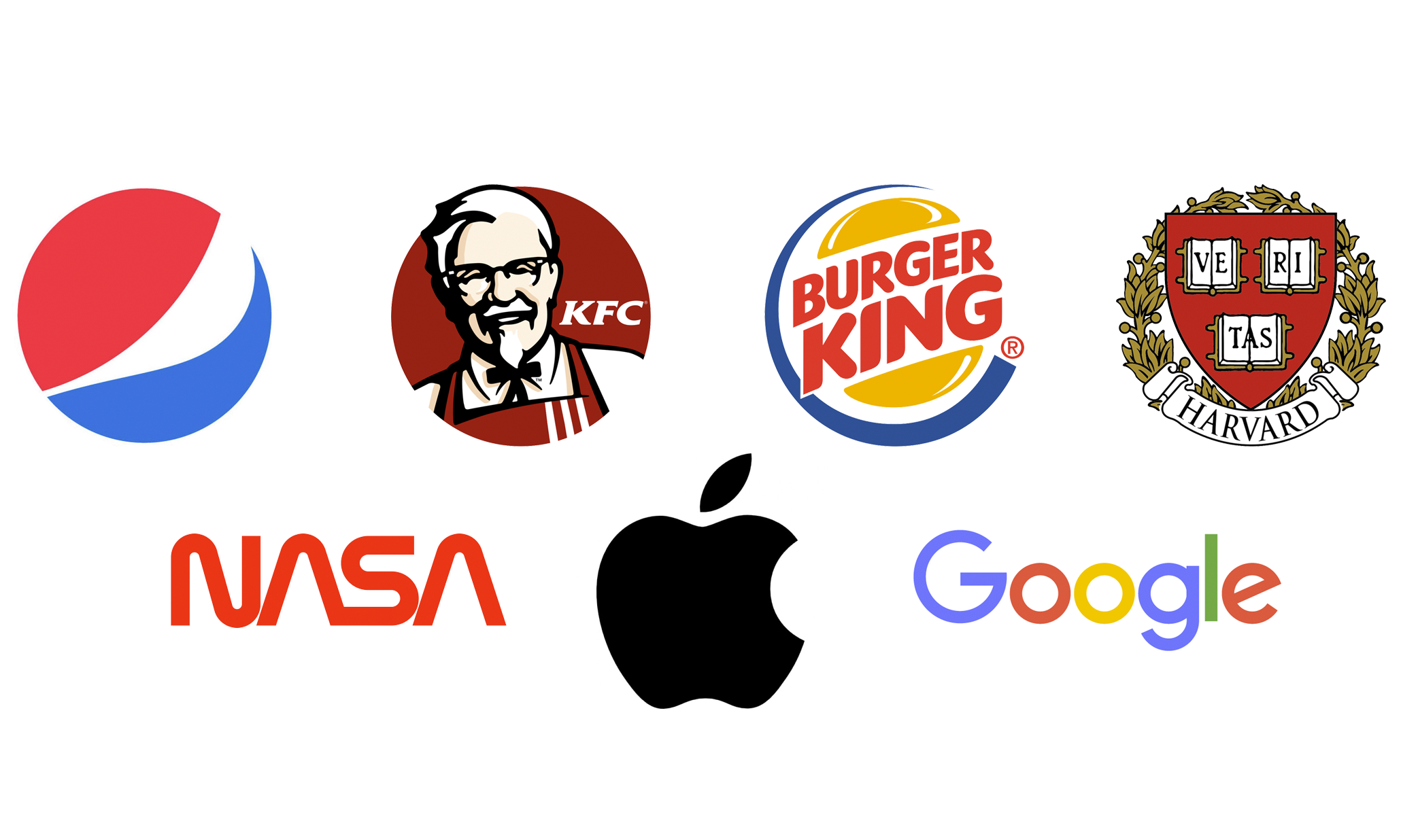
Minimalist logos are popular because they are easy to recognize and remember. They also have a timeless quality that allows them to remain relevant and effective over time. Many well-known brands, such as Nike, Apple, and Google, use minimalist logos to represent their brand identity.
When designing a minimalist logo, it’s important to focus on the essential elements of the brand and strip away any unnecessary details. The logo should be easily scalable and legible in different sizes and contexts, such as on websites, social media, and marketing materials.
Overall, a well-designed minimalist logo can be a powerful tool for building a strong brand identity and making a lasting impression on customers.
Designing a minimalist logo requires careful attention to detail and a focus on simplicity. Here are some tips and tricks for creating a minimalist logo that effectively represents your brand:

Focus on the essentials
The first step in creating a minimalist logo is to focus on the essential elements of the brand. Consider the core values and characteristics that define the brand, and try to distill these into a simple, recognizable symbol or icon.
Use negative space
Negative space refers to the space around and between the elements of a design. When designing a minimalist logo, negative space can be used to create subtle, yet impactful visual effects. Consider how negative space can be used to create a hidden shape or message within the logo.
Keep it simple
A minimalist logo should be simple and easy to recognize. Avoid using too many elements, and focus on creating a clean, uncluttered design. Stick to a limited color palette and use typography sparingly.
Ensure scalability
A minimalist logo should be easily scalable, meaning it should look good in both large and small sizes. Consider how the logo will look on different platforms and mediums, such as social media, websites, and printed materials.

Test and refine
Once you have a basic design for your minimalist logo, test it on different platforms and contexts to see how it performs. Refine the design as needed to ensure that it effectively represents the brand and resonates with the target audience.
Work with a professional
Creating a minimalist logo requires a high level of design skill and attention to detail. Consider working with a professional logo designer who has experience creating minimalist logos that effectively represent a brand’s identity and values.
Overall, a well-designed minimalist logo can be a powerful tool for building a strong brand identity and making a lasting impression on customers. By focusing on the essentials, using negative space, and keeping the design simple and scalable, you can create a minimalist logo that effectively represents your brand and resonates with your target audience.
Selecting the right colors for a minimalist logo is crucial to its success. Here are some tips for choosing the best colors for a minimalist logo:
- Stick to a limited color palette: A minimalist logo should have a limited color palette, typically consisting of one or two colors. This helps to create a clean, uncluttered design that is easily recognizable.
- Consider the brand personality: The colors used in a minimalist logo should reflect the brand’s personality and values. For example, blue is often associated with trust and professionalism, while green is associated with growth and nature.
- Use high-contrast colors: When selecting colors for a minimalist logo, consider using high-contrast colors that will make the design stand out. For example, black and white or red and white can create a strong visual impact.
- Test different color combinations: Try out different color combinations to see which ones work best for the brand and design. Experiment with different shades and tones of the same color, as well as complementary or contrasting colors.
- Consider the context: The colors used in a minimalist logo should be appropriate for the context in which it will be used. For example, a minimalist logo for a children’s brand might use bright, playful colors, while a minimalist logo for a financial institution might use more muted, professional colors.
Overall, choosing the right colors for a minimalist logo requires careful consideration of the brand’s personality, values, and context. By sticking to a limited color palette, using high-contrast colors, and testing different color combinations, you can create a minimalist logo that effectively represents the brand and resonates with the target audience.