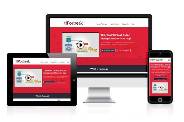
As more and more people use their smartphones and tablets to browse the internet, the importance of responsive design for websites and apps is becoming increasingly apparent. Responsive design is the process of designing websites and applications to adapt to different screen sizes and orientations, providing a seamless user experience across all devices.
In this article, we will explore the importance of responsive design for websites and apps, its benefits, and some tips on how to implement it effectively.
Why Responsive Design is a Must-Have for Modern Websites and Apps

In today’s digital age, having a website or app that looks good and functions well on any device is crucial. Responsive design is the key to achieving this. Here are some reasons why responsive design is a must-have for modern websites and apps:
- Mobile Usage is Increasing: Mobile usage has overtaken desktop usage, making it essential for websites and apps to be mobile-friendly. If your website or app is not optimized for mobile devices, users are likely to abandon it and look for a competitor’s site that is mobile-friendly.
- Improved User Experience: Responsive design improves user experience by allowing users to access your website or app on any device without any issues. With responsive design, your website or app will automatically adjust to the screen size of the device, providing a seamless experience.
- Better SEO: Google prefers responsive websites and ranks them higher in search results. Responsive design ensures that your website or app can be easily crawled by search engines, which improves your search engine optimization (SEO) efforts.
- Cost-effective: Responsive design is cost-effective in the long run. Instead of creating multiple versions of your website or app for different devices, responsive design allows you to have a single website or app that adapts to all devices.
- Future-Proof: With the rise of new devices and screen sizes, responsive design ensures that your website or app is future-proof. It can easily adapt to new devices without the need for a complete redesign.
In conclusion, responsive design is a must-have for modern websites and apps. It improves user experience, SEO, and is cost-effective in the long run. With the increasing use of mobile devices, it is essential to have a website or app that is accessible on any device.
The Benefits of Responsive Design for User Experience and SEO

Responsive design has become a necessity for modern websites and apps due to its many benefits for user experience (UX) and search engine optimization (SEO). Here are some of the most important benefits of responsive design:
- Improved user experience: With responsive design, users can access your website or app on any device, including desktops, laptops, tablets, and smartphones, and the content will adjust automatically to fit the screen size. This means that users can enjoy a consistent and seamless experience regardless of the device they are using, leading to higher engagement, longer sessions, and lower bounce rates.
- Cost-effective and efficient: Instead of building separate websites or apps for different devices, responsive design allows you to create a single design that adapts to all screen sizes. This means you can save time, money, and resources on development, maintenance, and updates.
- Increased SEO performance: Search engines like Google prefer responsive design because it helps them crawl and index your content more easily and accurately. With responsive design, you have a single URL and HTML code for all devices, which means there is no need to create separate mobile versions or duplicate content. This can lead to higher search engine rankings, more organic traffic, and better conversion rates.
- Future-proof: With the rapid pace of technological change, it is impossible to predict what devices and screen sizes will be popular in the future. Responsive design provides a flexible and adaptable framework that can accommodate new devices and technologies as they emerge, without the need for significant redesign or development.
In summary, responsive design is a must-have for modern websites and apps because it improves user experience, is cost-effective and efficient, boosts SEO performance, and is future-proof. By implementing responsive design, you can ensure that your website or app delivers a high-quality experience to all users, regardless of the device they are using.
How to Make Your Website or App Responsive: Best Practices
Having a responsive website or app is crucial in today’s digital landscape. With a variety of devices available to access the internet, it’s essential to ensure that your website or app looks great and functions well on all of them. Here are some best practices for making your website or app responsive:
- Use a Mobile-First Approach: When designing your website or app, start with the mobile version first. This ensures that you prioritize the most critical information and elements and ensure they fit on a smaller screen.
- Utilize Responsive Design Frameworks: Responsive design frameworks like Bootstrap or Foundation provide pre-built templates and CSS stylesheets that make designing a responsive website or app much easier.
- Optimize Images and Media: Large image files can slow down page load times and negatively impact the user experience. Use compression tools to optimize images for web use, and consider using responsive media queries to adjust the size of images based on screen size.
- Design for Touchscreens: With more and more people using touchscreens to access the internet, it’s essential to design your website or app with touch gestures in mind. Ensure that buttons and links are easy to tap, and allow for swiping and scrolling.
- Test on Multiple Devices: To ensure that your website or app is truly responsive, test it on a variety of devices with different screen sizes, including smartphones, tablets, laptops, and desktop computers.
By following these best practices, you can create a website or app that provides an excellent user experience across all devices, helping to improve engagement and drive conversions.
The Impact of Mobile Devices on Web Design and Development

Mobile devices such as smartphones and tablets have revolutionized the way we access information and communicate with others. As a result, web design and development have undergone significant changes in recent years to adapt to the unique challenges and opportunities presented by mobile devices.
Here are some of the key ways that mobile devices have impacted web design and development:
- Mobile-first approach: With more users accessing websites and apps from their mobile devices than ever before, many designers and developers are now taking a mobile-first approach to their work. This means designing and developing the mobile version of a site or app before tackling the desktop version. This approach ensures that the site or app is optimized for mobile users and provides a better user experience.
- Responsive design: Responsive design is a design approach that aims to provide an optimal viewing experience across all devices, whether it’s a desktop computer, tablet, or smartphone. With responsive design, the site or app adapts to the screen size and orientation of the device, providing a seamless user experience.
- Simplified design: With the limited screen real estate of mobile devices, designers and developers have had to simplify their designs to make them more usable on smaller screens. This has led to a trend towards minimalism and flat design, with simple, clean lines and a focus on typography and color.
- Touchscreen interfaces: Mobile devices are primarily controlled through touchscreens, which require a different approach to interface design compared to traditional mouse and keyboard interfaces. Designers and developers need to ensure that buttons and other elements are big enough to be easily tapped with a finger, and that navigation is intuitive and easy to use.
- App development: Mobile devices have also led to the growth of app development as a separate discipline from web design and development. While many websites are now designed to be mobile-friendly, some companies are choosing to develop dedicated apps to provide a more streamlined and customized user experience.
In conclusion, mobile devices have had a significant impact on web design and development, driving the adoption of new approaches such as mobile-first design, responsive design, and simplified design. As mobile devices continue to evolve and become more ubiquitous, designers and developers will need to keep up with the latest trends and best practices to ensure that their sites and apps provide the best possible user experience.
Responsive Design vs. Mobile Apps: Which is Right for Your Business?

As more and more people are using their mobile devices to access the internet, businesses are faced with a choice between creating a responsive website or a mobile app. Both options have their advantages and disadvantages, and the decision ultimately depends on the specific needs and goals of the business. In this article, we will explore the differences between responsive design and mobile apps, and help you determine which one is the right choice for your business.
Responsive Design:
Responsive design refers to the approach of designing a website that can adapt to different screen sizes and devices. This means that the website will look and function the same way on desktop, tablet, and mobile devices, providing a consistent user experience across all platforms. Responsive design is achieved through the use of flexible grids, images, and media queries, and requires only one website to be maintained.
Benefits of Responsive Design:
- Cost-effective: Responsive design only requires one website to be built and maintained, which can save businesses money in the long run.
- Better for SEO: Google recommends responsive design as the preferred mobile configuration, which can improve search engine rankings.
- Consistent user experience: Users can access the same content and features across all devices, leading to a better user experience.
Mobile Apps:
A mobile app is a standalone application that is designed specifically for mobile devices. Unlike a responsive website, a mobile app is installed on the user’s device and can access features such as push notifications and camera functionality. Mobile apps are developed separately from websites and require maintenance for both the app and the website.
Benefits of Mobile Apps:
- Increased functionality: Mobile apps can access device-specific features, such as camera and GPS, which can provide a richer and more engaging user experience.
- Improved user engagement: Push notifications can be used to send updates and reminders to users, keeping them engaged with the app and the business.
- Better performance: Since mobile apps are downloaded and installed on the device, they can run faster and smoother than a website.
Responsive Design vs. Mobile Apps:
When deciding between responsive design and mobile apps, consider the following factors:
- Business goals: If the goal is to provide a consistent user experience and present information to users, responsive design may be the better choice. If the goal is to provide specific functionality or access device-specific features, a mobile app may be more appropriate.
- User behavior: Consider how your users interact with your business. If they frequently access your website on their mobile devices, a responsive design may be the better choice. If they are looking for a specific tool or feature, a mobile app may be more convenient.
- Budget: Responsive design may be the more cost-effective option, but mobile apps may provide a better return on investment in the long run.
Conclusion:
Responsive design and mobile apps both have their advantages and disadvantages, and the decision ultimately depends on the specific needs and goals of the business. By considering the business goals, user behavior, and budget, businesses can make an informed decision on whether to invest in responsive design or a mobile app.
Common Responsive Design Mistakes to Avoid

Responsive design has become an essential aspect of modern web design and development. With the rise of mobile devices and the need for seamless user experiences across all devices, responsive design has become a must-have for businesses that want to stay ahead of the curve. However, as with any design project, there are some common mistakes that can be made. Here are some common responsive design mistakes to avoid:
- Ignoring User Needs: The most common mistake is not considering the user’s needs when designing a responsive website or app. Designers should prioritize usability and accessibility when creating responsive layouts.
- Overcomplicating Layouts: Another mistake is overcomplicating the layout of a responsive design. It is important to keep the design simple and easy to navigate on any device.
- Focusing Solely on Mobile: While mobile devices are important, a responsive design should work well on all devices, including desktops and tablets.
- Not Testing Properly: Designers should always test their responsive designs across different devices and browsers to ensure that the design is functional and looks great on all platforms.
- Using Large Images: Large images can cause slow load times and negatively impact user experience. Designers should use optimized images and consider using progressive loading techniques to improve loading times.
- Inconsistent Design: Inconsistencies in design, such as font sizes and layout, can create confusion and frustration for users. It is important to ensure that the design remains consistent across all devices.
- Lack of Hierarchy: A lack of hierarchy in the design can make it difficult for users to navigate the website or app. Designers should ensure that important elements are prominent and easy to find.
By avoiding these common responsive design mistakes, designers can create designs that are not only visually appealing but also provide a seamless user experience on all devices.
Tools and Frameworks for Responsive Web Design and Development”
Responsive web design has become a crucial aspect of modern website development. With the increasing number of devices used to access websites and the internet, it’s important for websites to be optimized for all screens and sizes. Fortunately, there are many tools and frameworks available to help developers create responsive websites. In this article, we’ll explore some of the most popular tools and frameworks for responsive web design.
- Bootstrap: Bootstrap is a widely used front-end development framework that offers a robust set of tools for creating responsive websites. It’s easy to use and offers pre-designed components that can be customized as needed. Bootstrap also includes a grid system that allows developers to create responsive layouts that adapt to different screen sizes.
- Foundation: Foundation is another popular front-end development framework that offers a variety of tools for creating responsive websites. It includes a responsive grid system, pre-designed components, and advanced features such as interchangeable UI patterns and responsive images.
- Materialize: Materialize is a responsive CSS framework based on Google’s Material Design language. It offers a variety of pre-designed components and a responsive grid system that makes it easy to create responsive layouts. Materialize also includes support for animation and advanced typography.
- Semantic UI: Semantic UI is a modern CSS framework that offers a variety of pre-designed components and a responsive grid system. It’s highly customizable and offers a unique theming system that allows developers to create their own custom designs.
- Susy: Susy is a lightweight grid system that allows developers to create responsive layouts without relying on pre-designed components. It’s highly flexible and allows developers to create custom grids that adapt to different screen sizes.
- Flexbox: Flexbox is a CSS layout module that allows developers to create flexible and responsive layouts without relying on a grid system. It’s easy to use and offers a variety of flexible layout options.
- Gridset: Gridset is a responsive design tool that allows developers to create custom grid systems that adapt to different screen sizes. It includes a variety of features such as breakpoint management, responsive typography, and a CSS generator.
In conclusion, there are many tools and frameworks available for creating responsive websites. Whether you prefer to use a pre-designed framework or create custom layouts, there’s a tool out there that can help you achieve your goals. By using these tools and following best practices for responsive design, you can create websites that look great on all devices and provide a positive user experience.
The Role of Responsive Design in E-Commerce and Online Sales

Responsive design has become increasingly important in the world of e-commerce and online sales. With more and more people using their mobile devices to shop online, it’s essential for businesses to ensure that their websites are optimized for all devices, including smartphones and tablets.
One of the main benefits of responsive design in e-commerce is that it creates a consistent user experience across all devices. This means that customers can easily navigate your website, find the products they’re looking for, and make purchases, regardless of whether they’re using a desktop computer or a mobile device.
In addition, responsive design can also improve your website’s search engine optimization (SEO). Google has stated that it prefers responsive websites over separate mobile sites, and may even penalize sites that are not optimized for mobile devices.
Responsive design can also help to increase your conversion rates and boost your sales. By creating a seamless user experience across all devices, you can reduce the likelihood of customers abandoning their shopping carts or leaving your website before making a purchase.
Another benefit of responsive design in e-commerce is that it can help to reduce your development and maintenance costs. Instead of having to create separate websites or apps for different devices, you can use a single website that adapts to different screen sizes and resolutions.
Overall, responsive design is a must-have for any e-commerce business that wants to stay competitive in today’s mobile-driven world. By creating a seamless and consistent user experience across all devices, you can improve your search rankings, boost your conversion rates, and increase your sales.
The Importance of Accessibility in Responsive Design
As the internet becomes more ingrained in our daily lives, it’s essential to ensure that websites and apps are accessible to all users, including those with disabilities. This is where responsive design comes in, as it allows for a more accessible and inclusive web experience for everyone.
Accessibility in responsive design refers to the practice of creating websites and apps that can be accessed and used by people with disabilities, such as visual, auditory, and motor impairments. By making these sites and apps accessible, we can create a more inclusive web that is available to everyone, regardless of their abilities.
Here are some ways that responsive design can help ensure accessibility:
- Responsive design accommodates different screen sizes and resolutions, making it easier for people with visual impairments to access web content.
- Designers can use responsive design to create websites and apps that are compatible with assistive technologies such as screen readers, magnifiers, and voice recognition software.
- Responsive design allows for better navigation and interaction for users with motor impairments, such as those who use a wheelchair or have limited mobility.
- Accessible design also takes into consideration the needs of users with cognitive disabilities, such as dyslexia or ADHD, by creating simple, clear, and organized layouts.
By incorporating these elements into responsive design, we can create websites and apps that are not only visually appealing but also accessible to all users. This can lead to increased engagement, satisfaction, and success for businesses and organizations.
In addition to providing a better user experience, creating accessible websites and apps is also becoming a legal requirement in many countries. For example, the Americans with Disabilities Act (ADA) in the United States requires businesses to provide accessible web content to people with disabilities.
Therefore, it’s essential to make accessibility a priority in web design and development. By using responsive design and following best practices for accessibility, we can create a more inclusive and accessible web for everyone.
Future Trends in Responsive Design: What to Expect in 2023 and Beyond
As the internet becomes an increasingly important part of our lives, responsive design has become essential for ensuring that websites are accessible and user-friendly on all devices, from desktops to smartphones. But as technology continues to evolve, what new trends can we expect to see in responsive design in the coming years? Here are some predictions for the future of responsive design:
- AI and Machine Learning: As AI and machine learning become more sophisticated, they will have an increasingly important role in responsive design. These technologies will be used to analyze user behavior and adjust website layouts in real time to provide the best possible user experience.
- Voice User Interface: As voice assistants like Siri and Alexa become more popular, designers will need to consider how to optimize websites for voice user interfaces. This means creating sites that can be navigated by voice and that provide information in a format that is easy to understand when read aloud.
- Augmented Reality: Augmented reality (AR) is already being used in a variety of applications, from gaming to shopping. In the future, it will play a larger role in responsive design by allowing designers to create immersive experiences that bridge the gap between the physical and digital worlds.
- Variable Fonts: Variable fonts allow designers to create custom typography that adjusts in real time to fit the user’s device and screen size. This means that fonts will no longer need to be selected manually, but will instead adapt to the user’s needs and preferences.
- Motion Design: Motion design is already a popular trend in responsive design, but it will continue to grow in importance in the coming years. As websites become more interactive, motion design will be used to create engaging and dynamic experiences that keep users coming back for more.
- 5G Technology: As 5G technology becomes more widely available, it will have a significant impact on responsive design. Websites will be able to load faster and provide more seamless experiences, making it easier for users to access the content they need on the go.
- Inclusive Design: Inclusive design ensures that websites are accessible to all users, including those with disabilities. In the future, designers will need to consider a wider range of accessibility issues, such as color blindness and cognitive disabilities, and ensure that their websites are designed to accommodate these needs.
In conclusion, responsive design is an ever-evolving field that is constantly changing to meet the needs of users and the demands of new technologies. By staying up-to-date with the latest trends and best practices, designers can create websites that are not only beautiful and functional, but also accessible and user-friendly for all.